 Minglyph
Give the title room to tell the story.
Explore a short book title through letter weight, spacing and one visual idea. Start with a square lettering study, then place it in a rough cover composition to see how the title and surrounding space work together.
Free public preview · No sign-up required · See plans and downloads
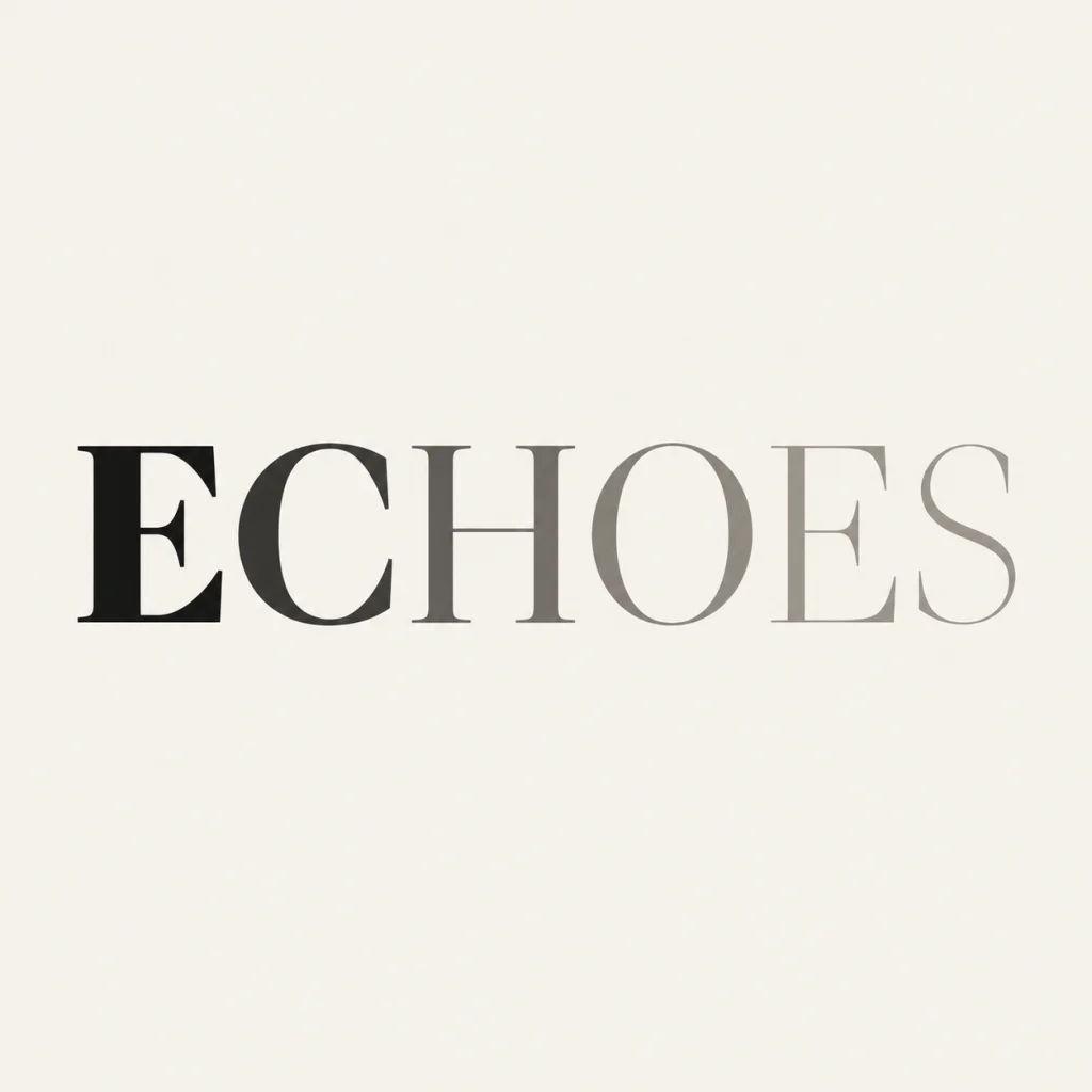
Let one story quality guide the letters.
Choose a concrete quality such as distance, tension or warmth, then translate it into a measured typographic decision. A quiet title might use spacious proportions; a forceful title might need a denser silhouette. The selected ECHOES example is an earlier music-title study reused here to show a fading sequence of weights. It is a starting principle for a book-title exploration, rather than a completed book cover. Compare another title-led cover approach.
Judge proportion inside the cover.
Place the square lettering image into a rough portrait cover before deciding which version works. Reserve space for the author and any subtitle in a layout editor. Compare title size, surrounding space and readability together at the intended use size; a narrow letter may read in the original square yet disappear beside a busy illustration. The thin gray end of ECHOES is a useful reminder to check contrast rather than only admire the transition. Study how a short message uses space.
Make the thumbnail carry the name.
View the rough cover as a small store-listing thumbnail, then inspect the lettering at full size. Check every character, the contrast at the thinnest strokes and the balance with the author line. For a long title, explore the most distinctive short phrase first and set the exact secondary wording separately. A PNG concept does not provide a print-ready wrap, spine, bleed or editable font.
Another way to approach the letters.
Selected studies with their own briefs. Open a direction and replace the text with yours.

A cover for the hours that feel like your own.
Use this direction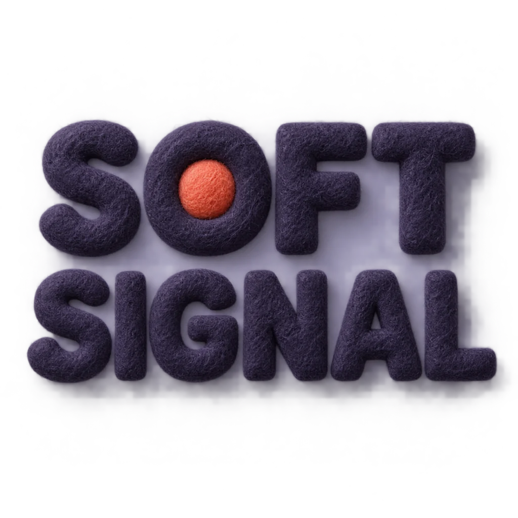
A gentle sound that still gets through.
Use this directionFrom your text to a considered image.
- 01
Use the exact title
Keep capitalization, accents, spaces and punctuation within the 40-character input limit.
- 02
Describe one story quality
Choose a palette and refine the meaning in Studio. Keep the first lettering decision focused.
- 03
Test the rough cover
Place the downloaded image in a layout editor. Check title proportions, whitespace and reading at thumbnail and intended cover size.
Before you create.
Does this generate a complete book cover?
It creates square AI lettering artwork for exploring a book title. Author text, subtitle, cover imagery, portrait layout, spine, bleed and printer specifications need separate layout work.
Can I generate my title in Chinese or mixed text?
Yes. Enter exact Unicode within the 40-character limit, including case, accents and punctuation. Inspect every Chinese stroke and other character after generation.
Why does the example say ECHOES?
ECHOES is a selected historical title image originally made for a music-cover study. It demonstrates a measured weight transition and its contrast limits; it was not newly generated for a book, and your results will vary.
Can I edit each letter or download a font?
Generated lettering is part of the artwork image. This workflow does not export font files, vector paths or editable glyph construction. Refine the brief for another concept.
How should I compare title versions?
Keep the wording fixed, place each version in the same rough cover and view it at the final use size. Compare proportions, surrounding space and readability together before judging decorative detail.