FIELD NOTES / 012

Ideas behind
the letters.

Practical notes on keeping a letter, word, name, or Chinese character readable while giving it one memorable visual idea.
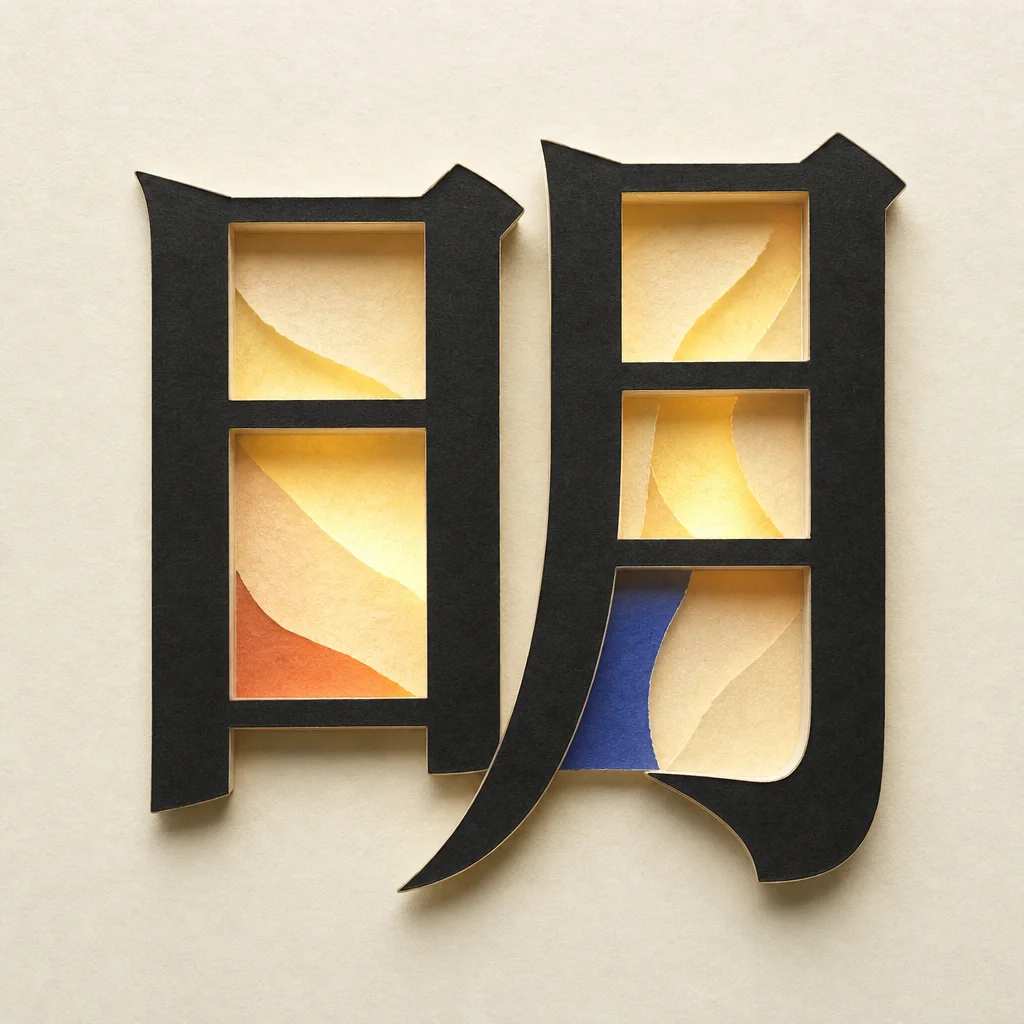
The exact Chinese character 明 built from dark paper with translucent light inside its structure01
LETTER STUDY / 01

How to turn one glyph into a visual idea

A practical method for making a distinctive glyph without sacrificing its original structure.

Read the note ↗
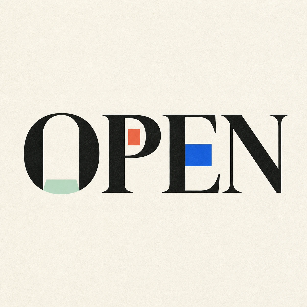
The word OPEN with its O counter becoming a small doorway02
WORD SYSTEM / 02

Word art that still reads like the word

Use baseline, spacing, rhythm, and counters to express meaning while keeping every letter intact.

Read the note ↗
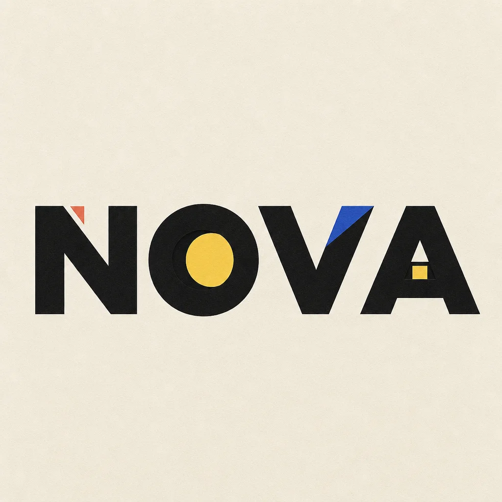
The word NOVA with a notch, eclipse disc, folded blue facet, and small window contained in its letters03
NAME & HANDLE / 03

A better way to design a visual name

Turn a brand name, creator handle, or project title into a memorable wordmark without losing recognition.

Read the note ↗
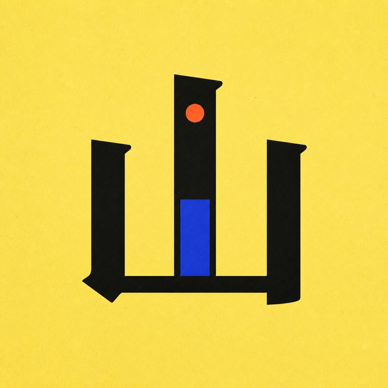
The Chinese character 山 with a weighted central stroke, a contained blue plane, and a coral summit04
CHINESE GLYPH / 04

How to turn a Chinese character into a visual mark

A structure-first method for giving one Chinese character a visual idea without inventing the wrong stroke.

Read the note ↗
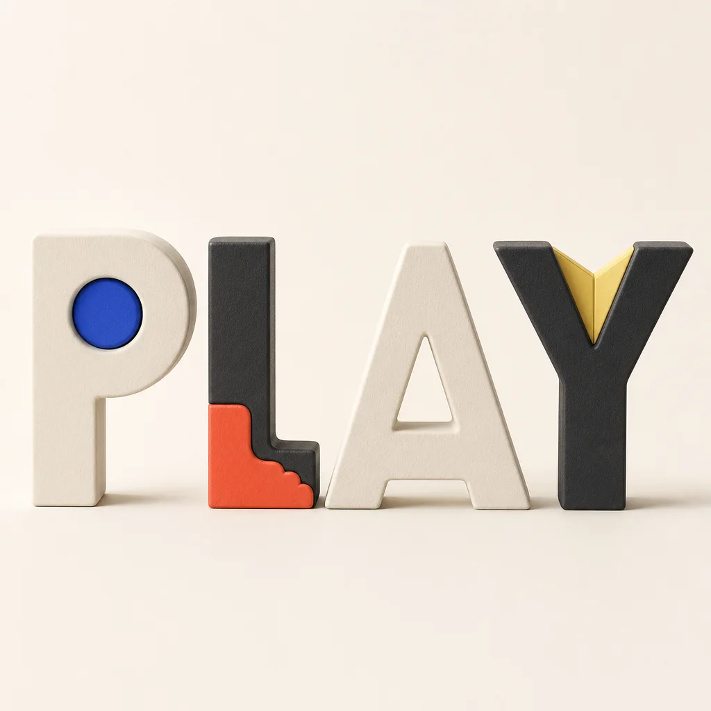
The word PLAY as four soft sculptural letters with one restrained visual action assigned to each05
LETTER BY LETTER / 05

When every letter gets its own idea

How to make Google-Doodle-like letter variations while keeping the exact word coherent and immediately readable.

Read the note ↗
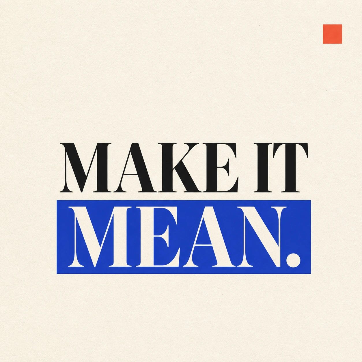
MAKE IT MEAN. set over two lines with the last word held by one solid blue field06
PROMPT SYSTEM / 06

A prompt system that does not quietly drift

Version the brand, style, format, palette, and text-accuracy rules so visual changes become deliberate and traceable.

Read the note ↗
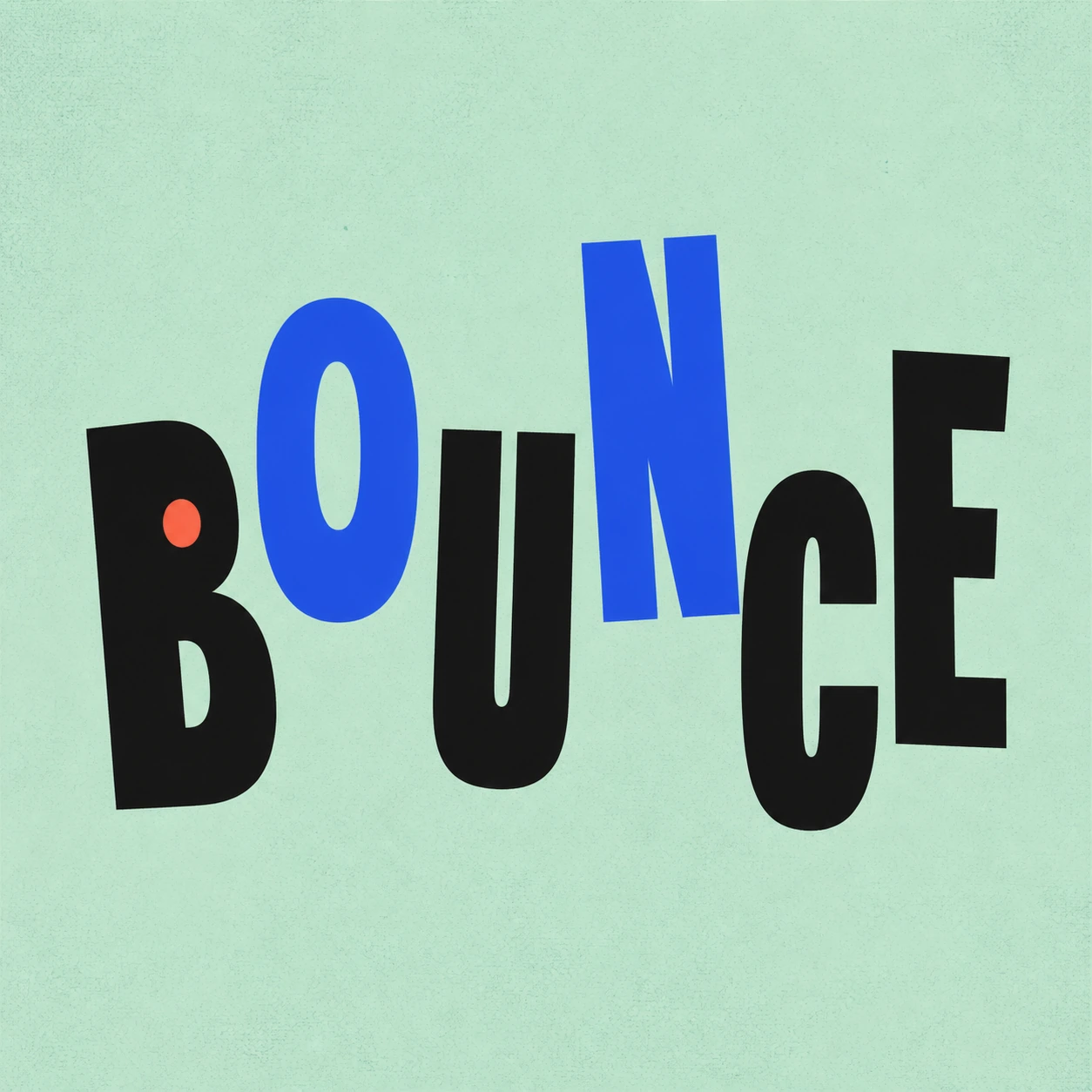
The word BOUNCE using alternating height, rotation, width, and one contained coral disc07
PLAYFUL WORD / 07

Make a word playful without losing the word

Give a familiar word timing, motion, and a small visual punchline while preserving instant recognition.

Read the note ↗
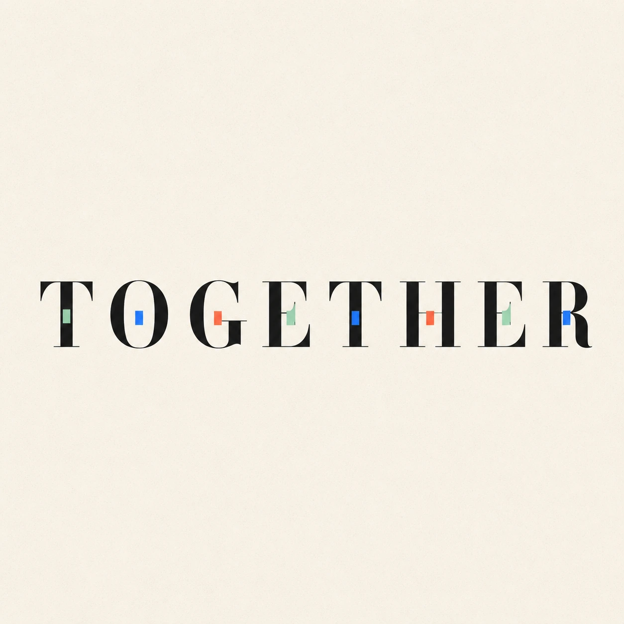
The word TOGETHER with a repeated family of small color inlays contained in separate letters08
IDENTITY SYSTEM / 08

From one name to a flexible visual system

Turn a distinctive name treatment into avatars, wordmarks, cards, and campaigns without inventing a new idea every time.

Read the note ↗
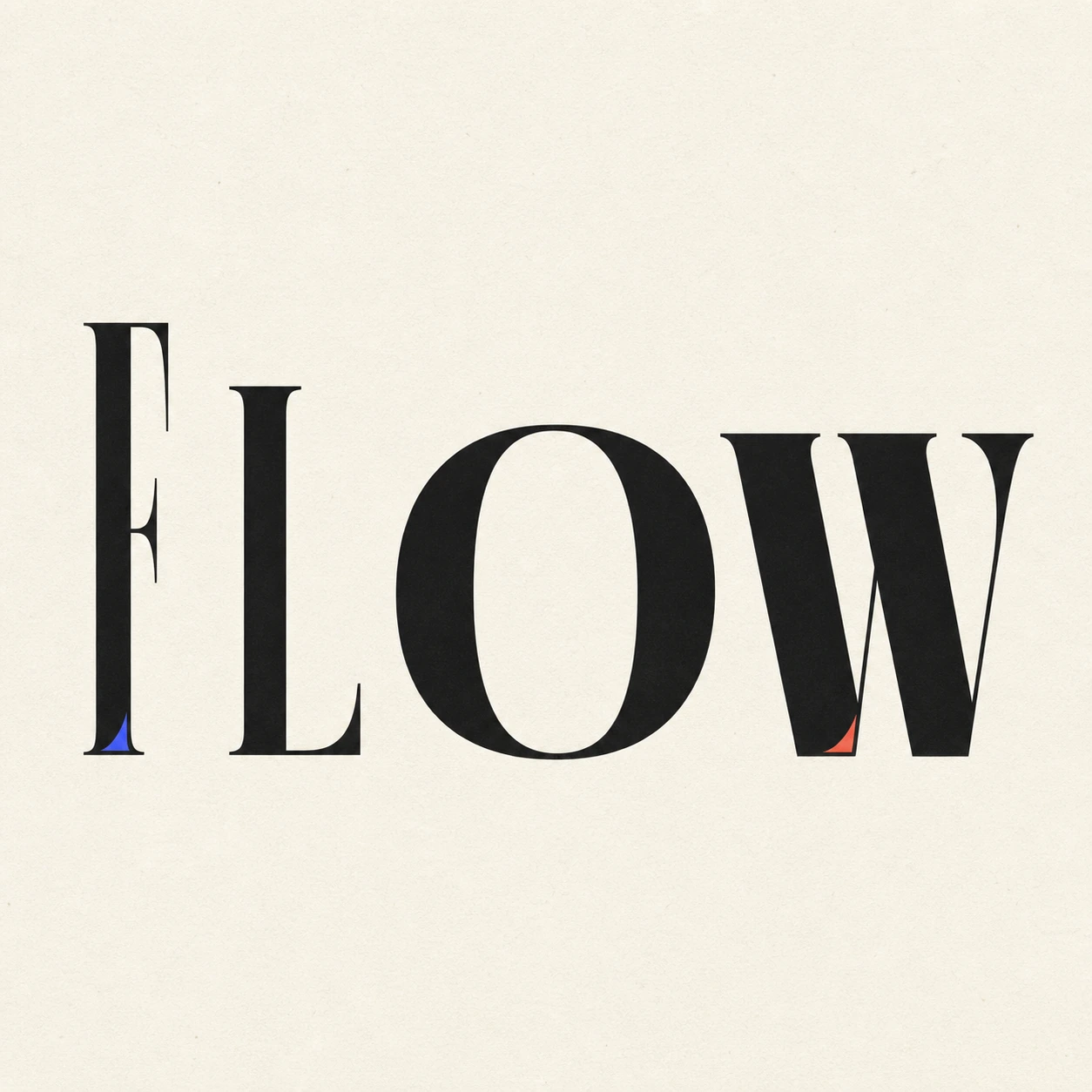
FLOW expressing motion through changing height, width, weight, and lean without a connecting line09
MOTION IN TYPE / 09

How to make typography feel fluid without a motion line

Use proportion, weight, lean, and spacing so the letters themselves carry the movement.

Read the note ↗
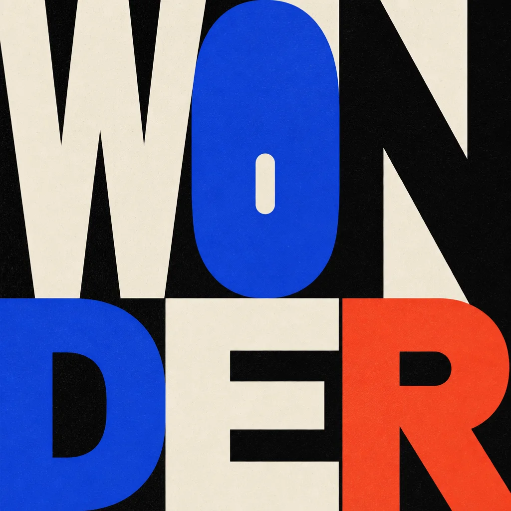
The exact word WONDER in a bold two-beat editorial composition with a small opening in O10
WORD STORY / 10

Turn one readable word into a visual story

Build a beginning, discovery, and ending directly into a word without turning it into a row of illustrated letters.

Read the note ↗
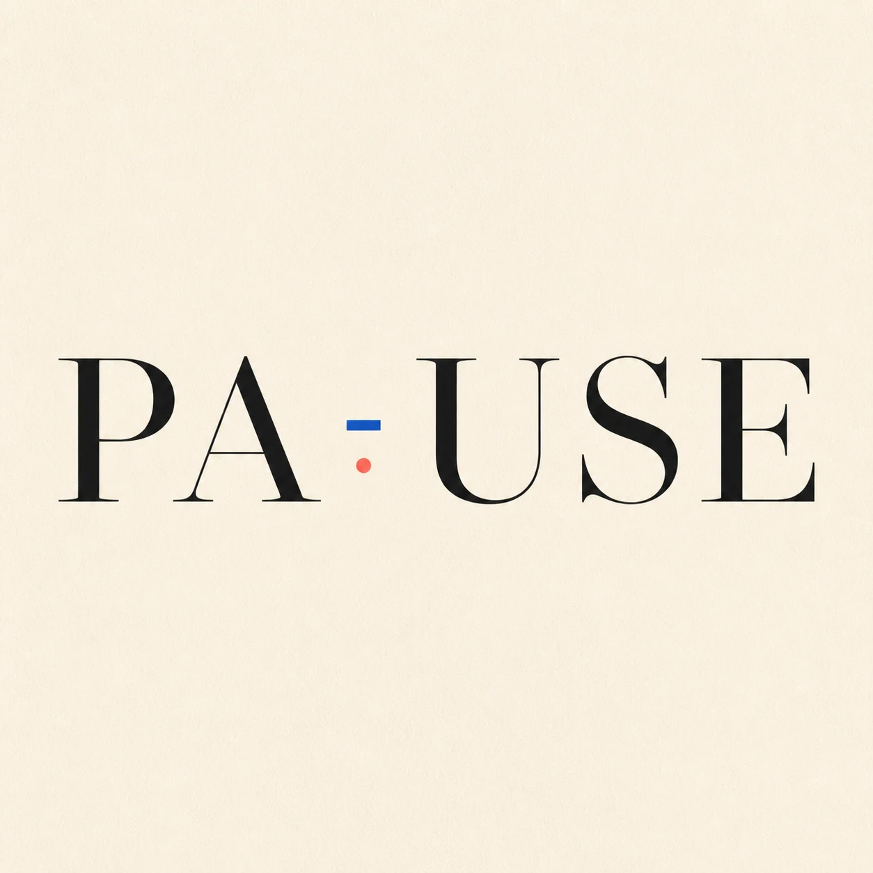
The word PAUSE with one deliberate interval marked by a small blue tick and coral point11
SPACE AS FORM / 11

Let empty space become part of the word

Use one deliberate interval to express rhythm without inserting an icon or breaking the spelling.

Read the note ↗
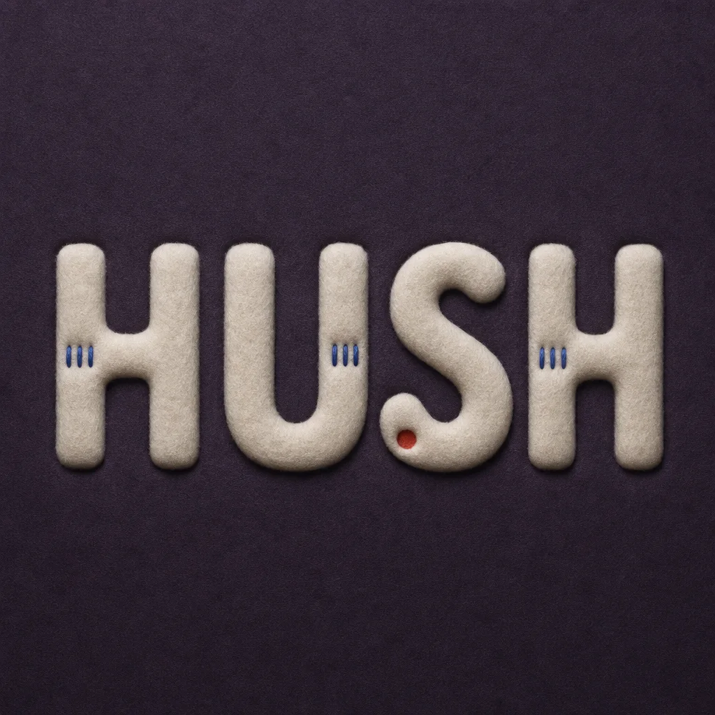
The exact word HUSH formed from shallow off-white felt relief with blue stitches and a coral indentation12
TACTILE TYPE / 12

Give typography texture without losing restraint

Use material, depth, and light as one typographic rule rather than turning the word into a novelty object.

Read the note ↗