Minglyph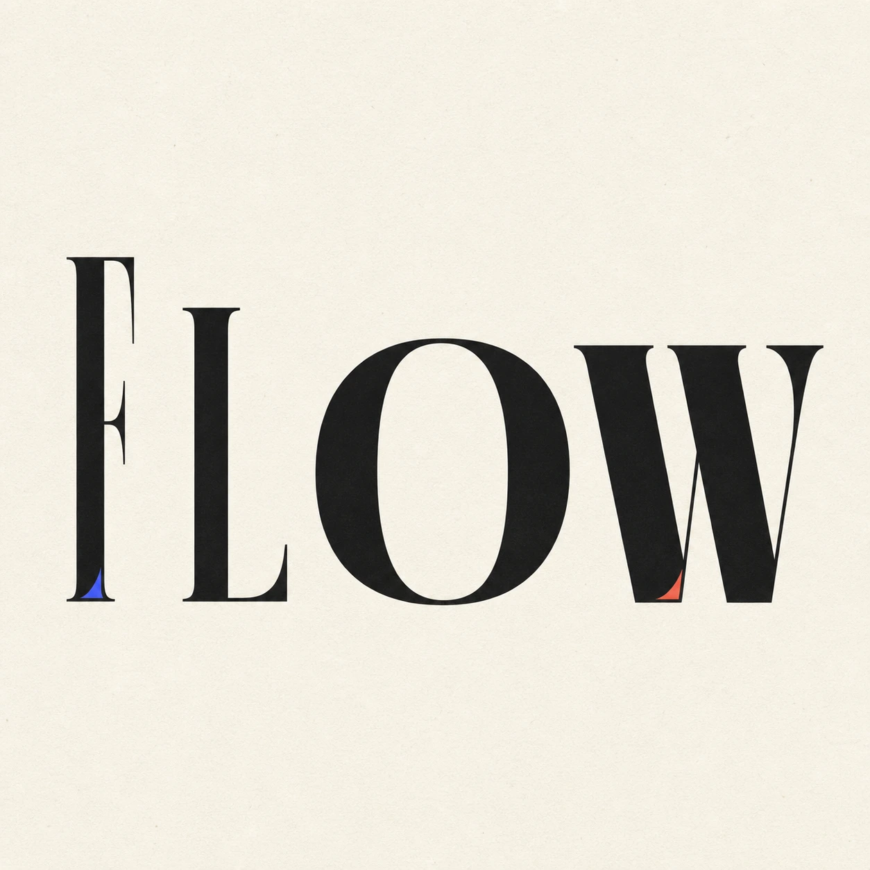
Build a progression, not a path
Map height, width, weight, lean, and spacing from the first character to the last. The sequence should explain the direction before any color accent appears.
Let letters yield differently
One character may narrow, another may open, and another may settle into a wider stance. Variation creates flow, while a shared type family and optical rhythm keep the word coherent.
Test the silhouette at thumbnail size
The letters themselves should imply direction at small scale. If movement appears only after adding a path or underline, return to proportion and spacing. A measured color change offers another progression, provided the last letters still hold enough contrast.