 Minglyph
Let color move through the word.
A gradual color shift can give a short title a softer rhythm without changing its letter shapes. Start with complete, flat lettering and one clear blend direction. Keep the background quiet so both ends of the transition remain readable.
Free public preview · No sign-up required · See plans and downloads
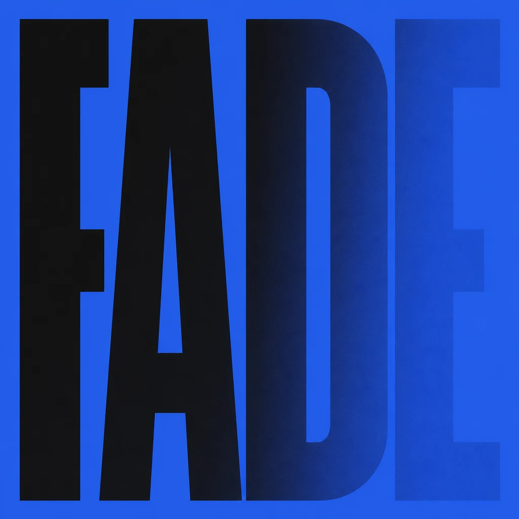
Use one blend as the governing idea.
The reused FADE study fades horizontally from near-black lettering toward its blue field. The continuous transition is clearest in D and E; it is a fading cover-title study rather than a precisely controlled color ramp. A consistent direction lets the whole word feel connected without joining its strokes. Keep the edges and counters solid enough to recognize before judging the color. For your own title, compare one blend direction at a time; adding bevels, texture and multiple color changes makes that choice harder to evaluate.
Check both ends against the background.
A gradient is readable only when its lightest and darkest regions remain distinct from the field behind them. Shrink the image and inspect the end of each stroke. In the example, E has visibly weaker contrast than F and A. That is a useful warning for a small cover: check the last letter as carefully as the first. If one part disappears, change the palette or ask for a calmer transition. A flat blend changes the fill color; it is a different visual idea from light spilling beyond a luminous tube. Compare lettering that emits light.
Choose color blending or flat color deliberately.
A smooth transition can soften a display word. Solid color blocks can give a title a more immediate printed silhouette. Compare those approaches with the same exact text before choosing a cover or social-tile direction. Place the PNG into a rough cover or social layout and judge the letter proportions, surrounding space and readability together at the intended display size. Minglyph interprets a written brief as an image; build any required exact color stops and reusable editable type in your design application. Compare a flat-color title.
Another way to approach the letters.
Selected studies with their own briefs. Open a direction and replace the text with yours.
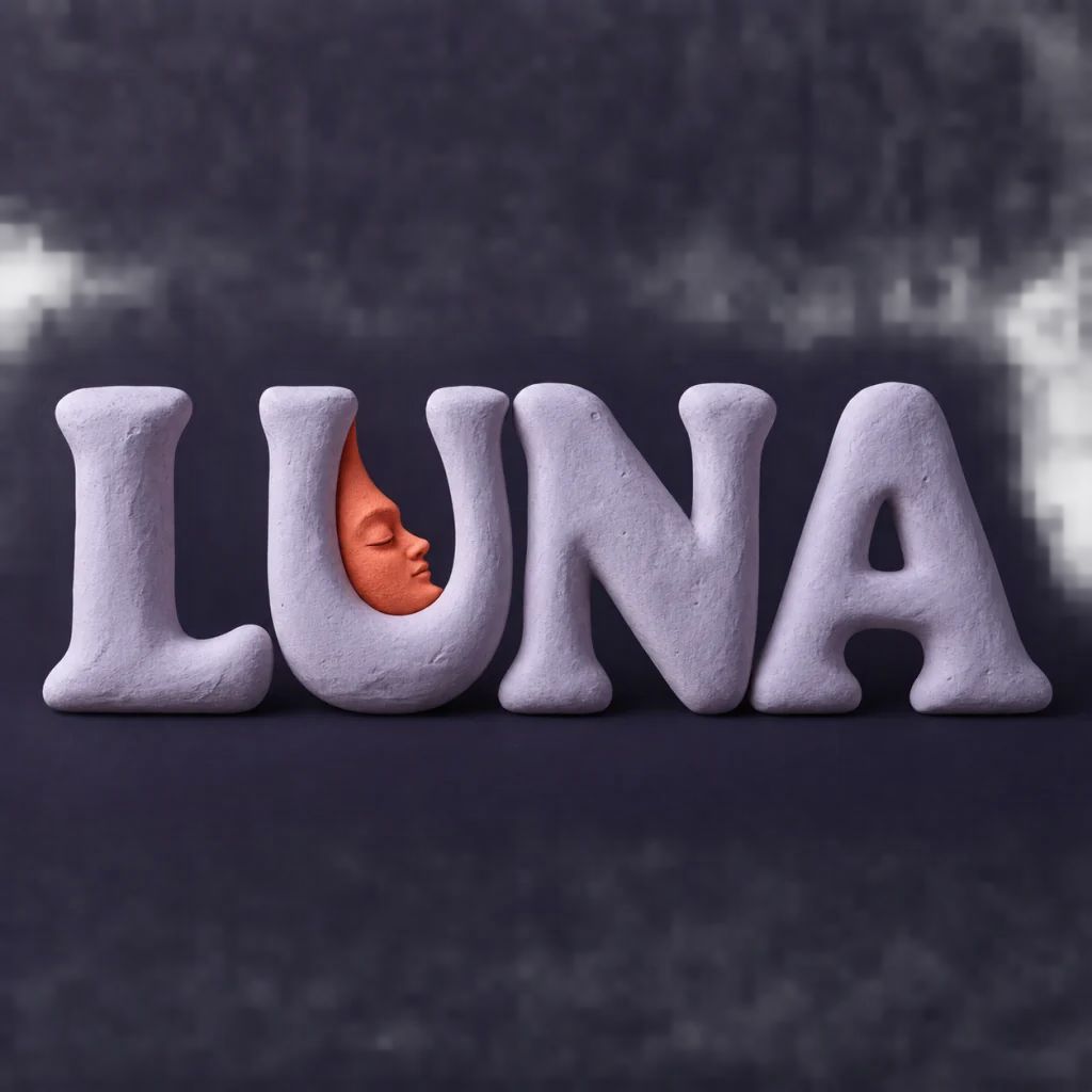
A familiar name with a softer side.
Use this direction
A clear direction for an ambitious idea.
Use this directionFrom your text to a considered image.
- 01
Enter the intended wording
Use up to 40 characters with the exact case, spacing and punctuation you want. Short text leaves room to see the transition.
- 02
Choose the palette and blend
Continue to the Graphic poster brief. Describe a single smooth color transition inside the letters and retain a contrasting background.
- 03
Check the whole gradient
Read the small image, then inspect edges and counters at full size. Reject a result with lost letters, unwanted banding or added words.
Before you create.
Can I set exact gradient stops, angles or hex colors here?
The page offers the existing palette choices and a written Studio brief. It is not a numerical gradient editor and does not lock stop positions or angles. Rebuild an exact production gradient in your design tool.
Is this CSS gradient text, SVG or a font file?
No. The result is a fixed square AI lettering image. It does not export CSS, an editable vector gradient or an installable font.
Will the letters have a transparent background?
This starter uses a contrasting opaque field. A visual color fade inside a letter is not an alpha channel. Check the actual downloaded image before using it as an overlay.
How should I judge proportions and readability?
Place the lettering PNG into a rough layout first, with the planned margins and supporting text. Inspect it at the final use size. Adjust the written brief and composition together rather than choosing proportion or readability in isolation.
Can I preserve Chinese characters or mixed-language names?
The brief carries exact Unicode input within 40 characters. Review strokes, accents, spaces and punctuation after generation; the color transition should never erase a required detail.