 Minglyph
Let the color settle into your words.
Give a name, a greeting or a short title the feel of watercolor on paper. Begin with clear letter shapes, then let transparent-looking washes and darker pigment edges bring variation to the wording.
Free public preview · No sign-up required · See plans and downloads
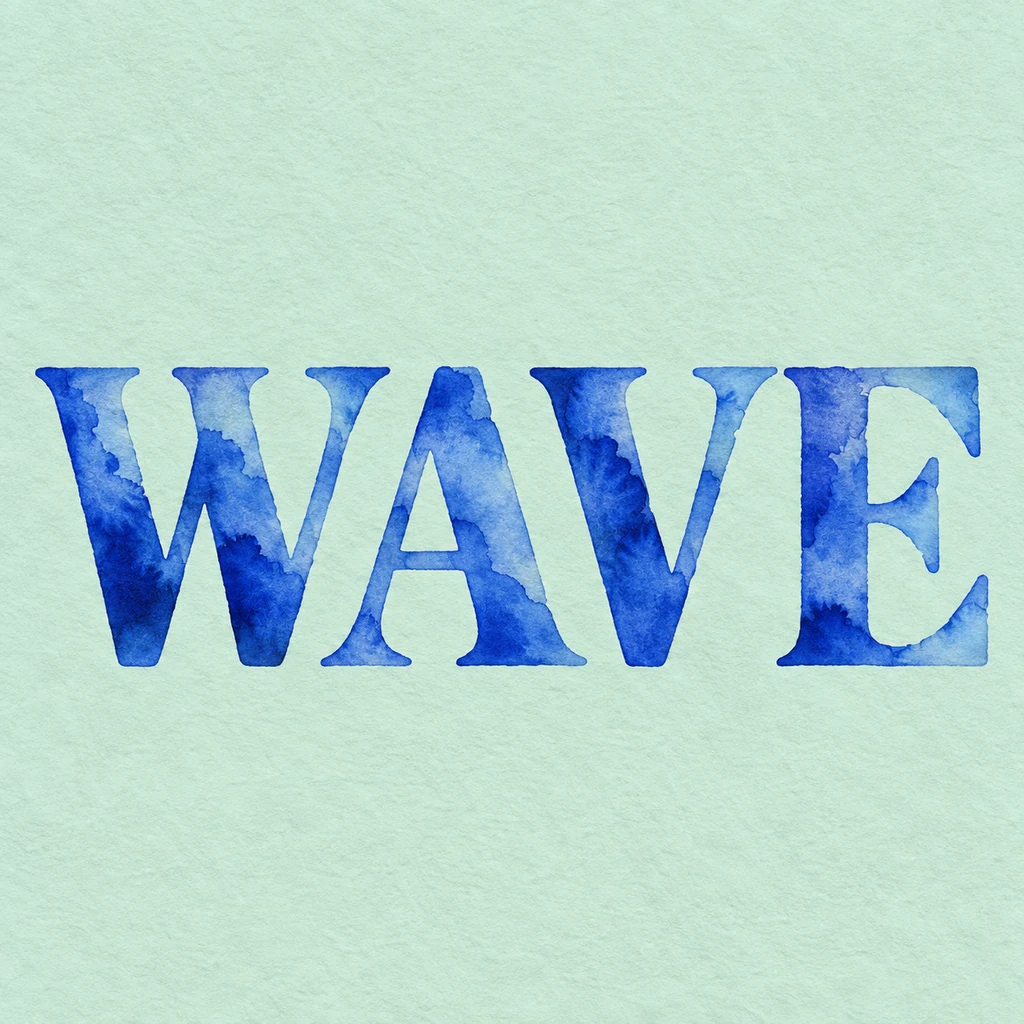
Keep a readable shape beneath the wash.
Watercolor lettering needs a balance between uneven pigment and a complete letter. In WAVE, light areas sit inside broad blue strokes while darker edges hold the word together. Check the thinnest stroke and the opening inside A before judging the texture. A wash that becomes as pale as the paper can make a crossbar disappear. Ask for a stronger letter silhouette if the word only reads when you already know what it says.
Choose where the paint can spread.
Small changes along the edge suggest wet pigment meeting textured paper. Keep that softness local: a large bloom across the space between two letters can make them look joined. This starter contains the paint within separate letter shapes and leaves out flowers and decorative splashes. For a greeting card or a personal title image, begin with the display wording alone. Put a longer message or event details in a separate editable layout.
Let the paper support the color.
A quiet paper field makes the translucent layers easier to see. The Coast study pairs ultramarine lettering with pale mint; compare their light-dark contrast before choosing a softer combination. Shrink the result to the size of the final card preview or social tile. The wording should remain clear after fine paper grain disappears. Then inspect the large image for broken edges, lost accents and unwanted marks around punctuation.
Another way to approach the letters.
Selected studies with their own briefs. Open a direction and replace the text with yours.
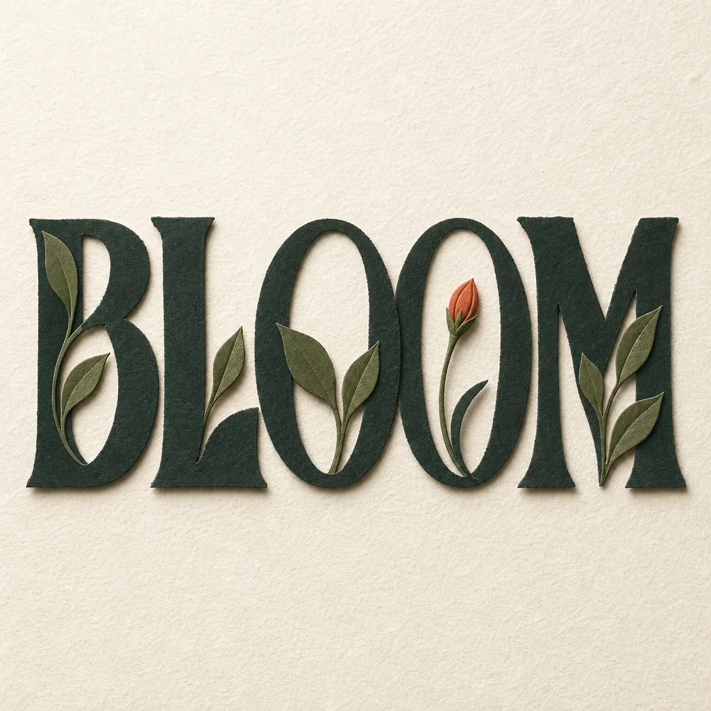
Some answers need time to flower.
Use this direction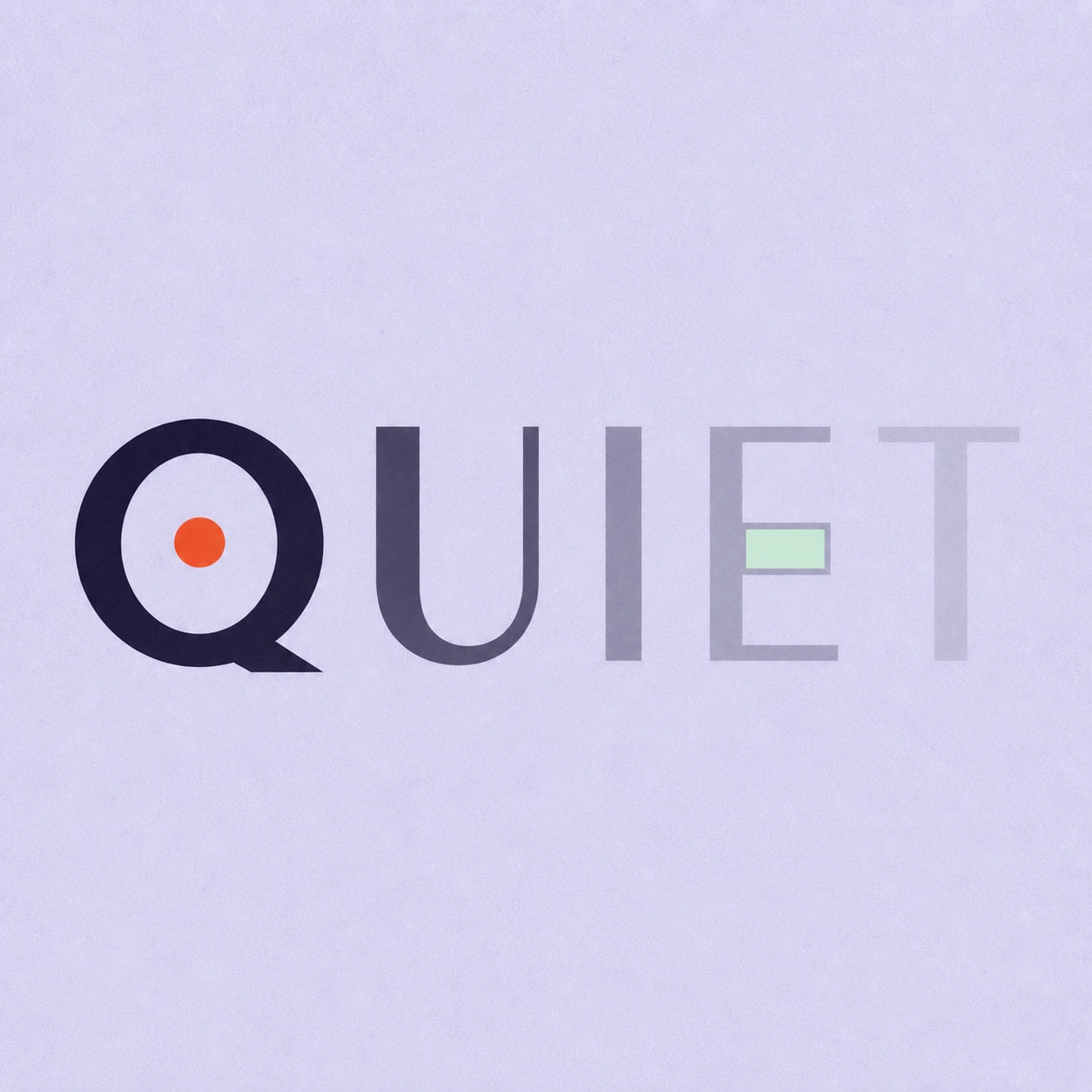
Silence is not empty. It is space kept deliberately.
Use this directionFrom your text to a considered image.
- 01
Write the words to paint
Enter up to 40 characters with the exact case, spaces and punctuation you want. Short wording leaves room for the wash to show.
- 02
Set the paint and paper mood
Choose a palette and continue to the Organic brief in Studio. Refine pigment density and edge softness while keeping complete letters.
- 03
Compare the wash with the outline
Read the small preview, then check individual strokes at full size. Keep a result that is clear before its pigment detail becomes visible.
Before you create.
How is this different from floral text?
The watercolor direction uses translucent pigment, pooled edges and paper texture. Floral text builds botanical detail around letter anatomy. This starter leaves flowers and leaves out so the painted letter itself is the subject.
Does translucent paint mean a transparent image background?
No. The lighter washes simulate watercolor on an opaque paper field. That appearance does not provide an alpha channel or a background-free overlay. Check the actual Studio download before placing it over another design.
Can I download a watercolor font or edit each brushstroke?
The result is a square artwork image. It does not create an installable font, vector paths or separate paint layers. Change the words or visual brief in Studio to explore another version.
Can I use Chinese characters, accents or mixed text?
Yes. The brief accepts exact Unicode within the 40-character limit. Review every character after generation, especially small accents and Chinese strokes where a pale wash or soft edge could hide a detail.