 Minglyph
Words with a handmade edge.
Give a title or name the feel of cut, folded and layered paper. Use shallow depth and visible edges to make the letters feel physical while keeping the spelling unmistakable.
Free public preview · No sign-up required · See plans and downloads
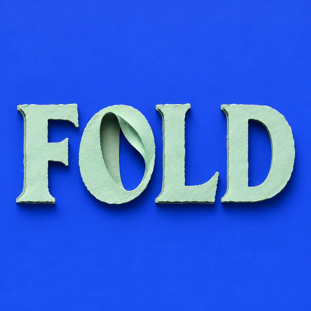
A small fold can do the work.
A paper-cut effect does not need a busy collage. A few visible layers, a curled inner edge and a soft shadow can explain the material. Keep the silhouette of every letter intact, then give one structural detail more attention. That creates a focal point without turning the word into a collection of disconnected scraps.
Decide between flat color and sculptural depth.
Flat paper shapes give a strong poster silhouette. A slightly raised layer creates a more tactile name study. Start with one approach, then compare the same text under another light or palette. Describe paper as the material in Studio so the natural-style recipe does not drift toward leaves or other organic decoration.
Use a paper image as a visual asset.
This workflow makes a rendered paper effect for a cover, post or editorial illustration. The image can inspire a physical craft, but it is not a set of cutting paths. If you need a Cricut or laser-cut file, rebuild and verify the letter shapes in an appropriate vector tool before fabrication.
Another way to approach the letters.
Selected studies with their own briefs. Open a direction and replace the text with yours.
A name that unfolds at its own pace.
Use this direction
Natural character with a precise silhouette.
Use this directionFrom your text to a considered image.
- 01
Set the lettering
Enter the final text. Mixed-case names and short capitals both make useful paper studies.
- 02
Set the paper direction
Use the layered-paper starter, then adjust the fold, texture or palette in Studio.
- 03
Review edges and shadows
Look for complete strokes, a consistent light direction and enough separation between neighboring letters.
Before you create.
Is this a real paper-cut template?
No. It generates an artwork image with a paper-cut appearance. It does not create measured cutting patterns or machine-ready SVG paths.
Can I use a torn-paper effect?
Describe a restrained torn edge in Studio. Keep the main letter silhouette clear so the texture does not change the spelling.
Can I generate Chinese paper lettering?
Yes. Enter the exact Chinese characters and inspect each stroke after generation. The Chinese name page offers more guidance for multi-character names.
How is this different from 3D text?
The paper preset emphasizes thin layers, folds and shallow shadows. The 3D text starter emphasizes more solid sculptural volume, such as clay or felt.