Minglyph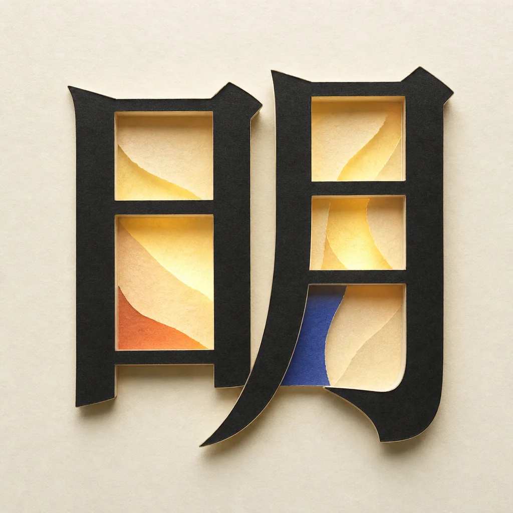
Begin with the unmodified letter
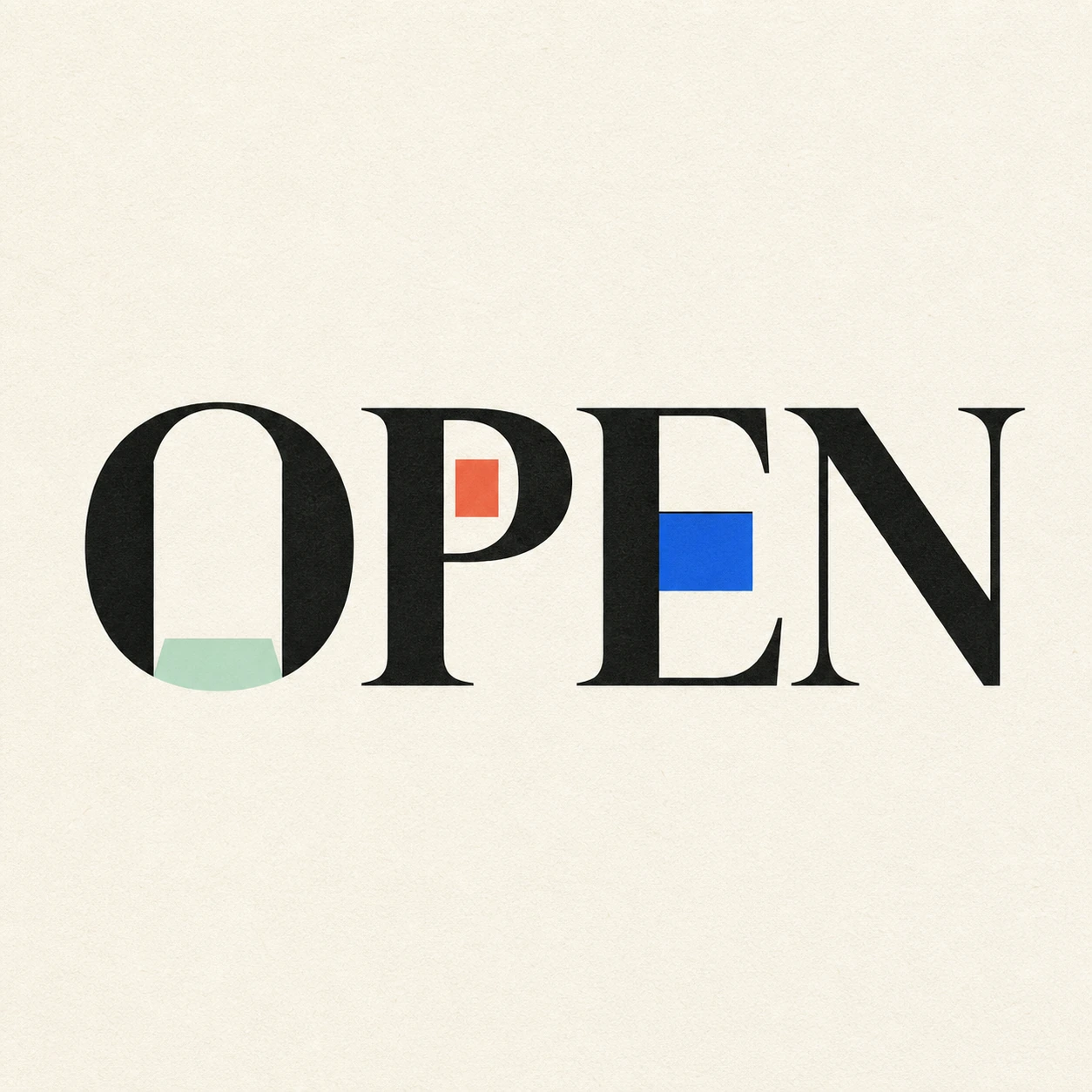
Set the glyph in a clear typeface first. Study its counter, joint, terminal, crossbar, and silhouette. If the plain letter is not readable at the intended size, decoration will not rescue it.
Choose one structural moment
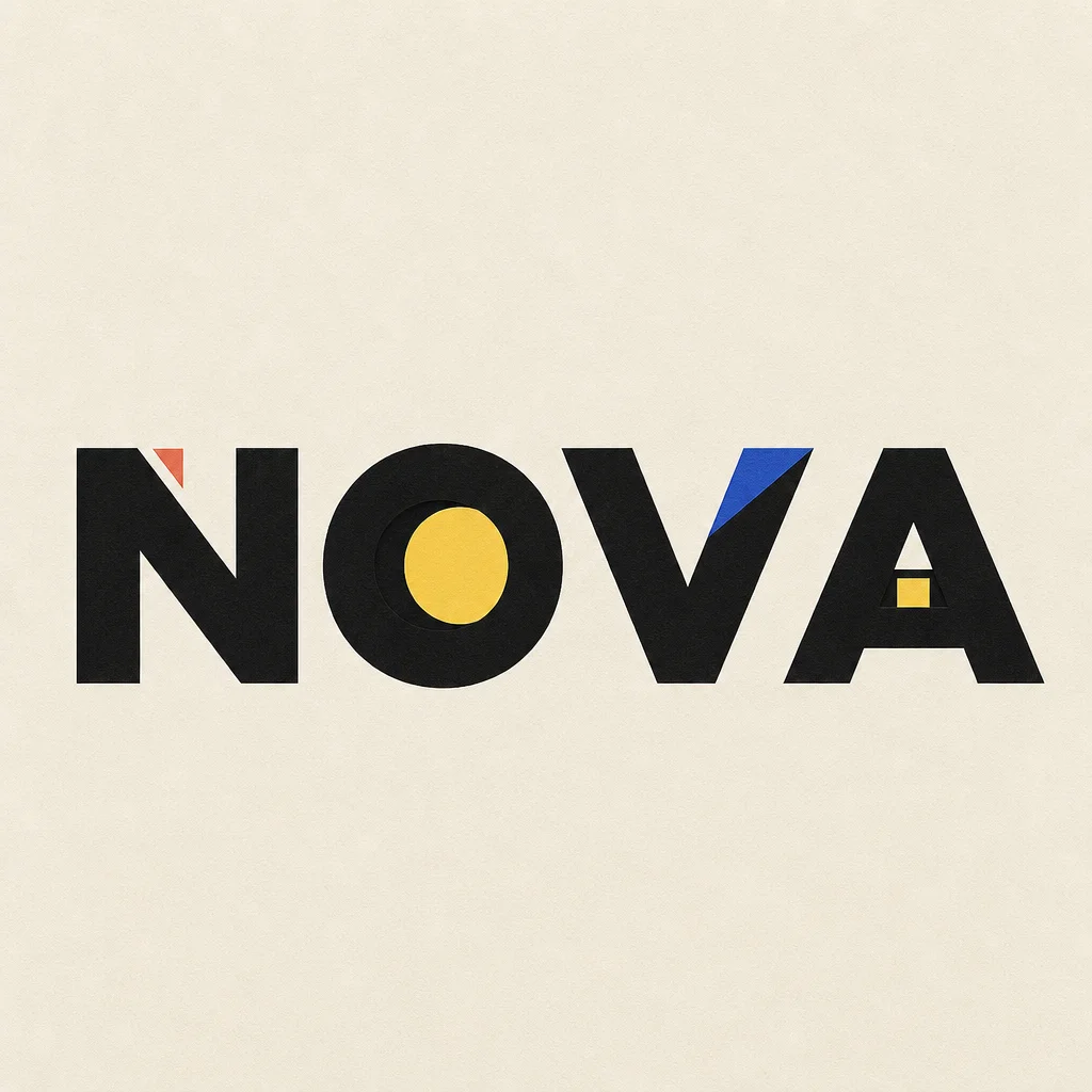
The strongest move usually happens in one place: a counter holds a solid disc, a crossbar changes weight, or a terminal gains a precise cutout. One place is enough to carry the idea.
Test the silhouette again
Blur it, shrink it, and show it without the explanation. The changed letter should still be named correctly before the viewer notices the metaphor.