 Minglyph
Give the coffee name a clear place on the bag.
Explore the lettering for one coffee or blend name. Place the square PNG concept into your label layout, then compare the name with separately editable roast information, product details and the roastery identity.
Free public preview · No sign-up required · See plans and downloads
Separate the product name from the roastery.
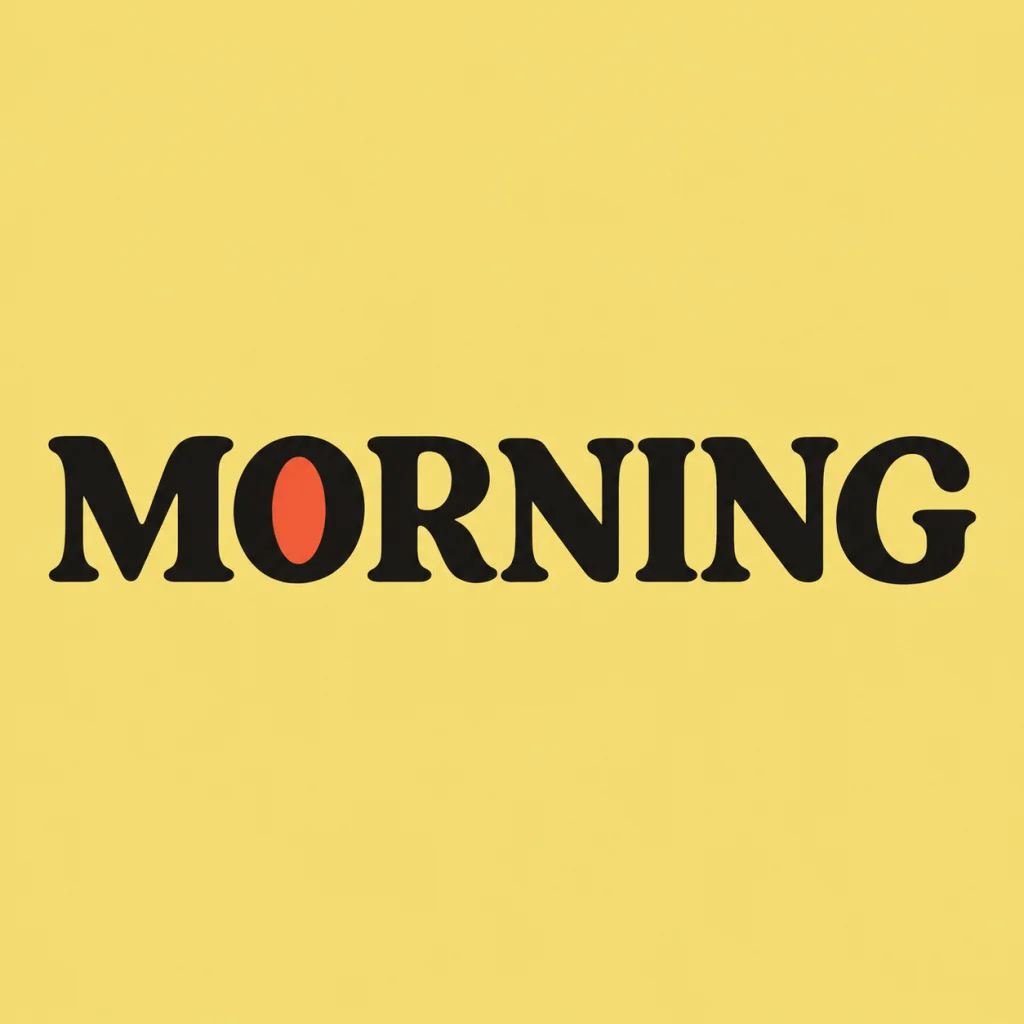
Decide which words identify this coffee and which identify the business behind it. A blend name may lead the front label while the roastery signature stays smaller and consistent across products. MORNING is an earlier owned cafe-wordmark study, reused here to show a readable name component. Its black serif forms and warm field suggest a voice; the image does not establish a real coffee product or supply its facts. Compare a roastery master wordmark.
Judge the whole label at its real size.
Make a rough front label with the coffee name, roast information, origin and net quantity supplied as ordinary editable text. Set the artwork inside that composition without stretching its square background to match the bag. Compare name size, spacing and contrast with all the supporting information together. Print a paper mockup at the intended dimensions and hold it against the bag; folds, seals and the surrounding surface can change what reads first. If an inked texture suits the product, compare a restrained version at that same size and check that small gaps remain readable. Compare a controlled ink texture.
Keep product details out of the generated name.
Use Minglyph to explore one exact short name, then finish the information hierarchy in a layout editor. Read every accent and punctuation mark in the image and verify all supplied coffee facts independently before production. Check the chosen printer file specification, color process and usable image dimensions. An opaque square artwork has its own background; it is not a transparent mark, editable font or measured packaging file.
Another way to approach the letters.
Selected studies with their own briefs. Open a direction and replace the text with yours.
A warm start for a neighborhood cafe.
Use this direction
An independent brand with room to grow.
Use this directionFrom your text to a considered image.
- 01
Enter the exact product name
Use the coffee or blend name within 40 characters. Keep the roastery name and changing batch information separate when they serve different roles.
- 02
Choose a readable voice
Pick a palette and review the editorial brief in Studio. Describe the feeling of the coffee name without asking the model to invent product details.
- 03
Proof one complete front label
Place the PNG in your rough label, add the supplied information as editable text and review proportions and reading together on an actual-size paper mockup.
Before you create.
Does this make a complete coffee bag label?
It explores a square AI lettering image for one coffee name. Build the full label, product information and production file in your layout editor.
How is this different from the cafe wordmark page?
A cafe wordmark identifies the business across signs, menus and other placements. This task tests one coffee product name beside the supporting details on a specific bag label.
Can I generate roast, origin and weight information inside the artwork?
Keep those supplied facts as editable text in the label layout so they can be verified and updated. This starter asks for the name rather than a collection of small product details.
Why is MORNING shown?
MORNING is an owned historical cafe-wordmark concept. Its seven letters show a clear name treatment with an opaque yellow field. It is reused here, not a new packaged-product commission or proof of print quality.
Can I use accents, Chinese characters or mixed text?
Enter the exact Unicode text, spaces and punctuation within 40 characters. Inspect every character at the intended label size and review the complete information layout before printing.