 Minglyph
Let the ink look handled.
Turn a short name, label word or headline into a square image that suggests an ink stamp. Start with complete letters, then introduce just enough uneven contact to give the print a human edge.
Free public preview · No sign-up required · See plans and downloads
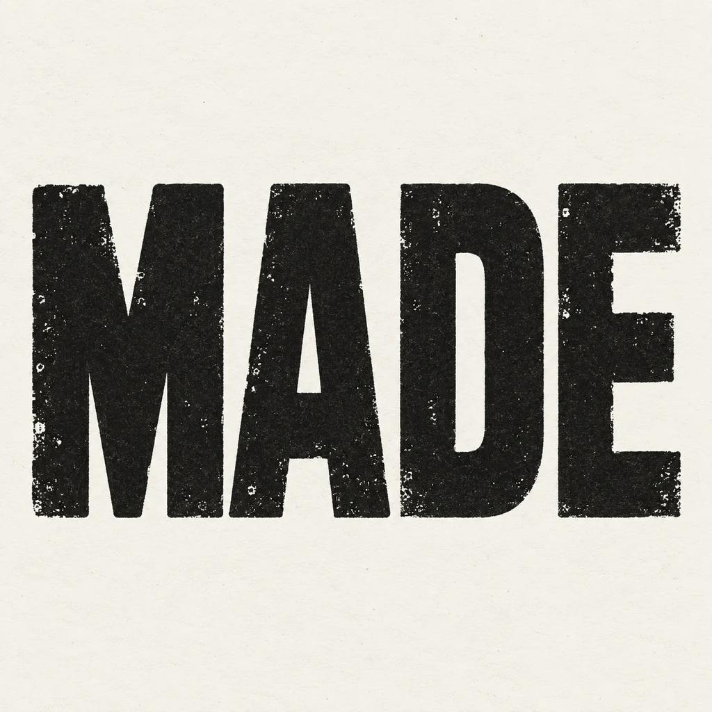
Keep the word stronger than the wear.
The MADE study uses heavy capitals with small ink skips inside their faces. The M joints, A and D counters, and three E bars remain clear even when the texture is visible. Try the same test with your own text: cover the tiny grain with your eye and read the underlying word first. If an ink gap becomes a missing stroke or changes punctuation, ask Studio for a cleaner impression.
Choose a surface, then compare its scale.
A continuous paper field helps the stamped edge feel believable without adding a document, seal or official symbol. Compare a crisp impression with a slightly uneven one before adding more distress. At thumbnail size, fine gaps may disappear; large tears can make neighboring letters merge. Leave open space around the word so it can sit inside a packaging or poster layout later.
Use the image as a direction, not a stamp file.
This square artwork can guide a handmade label, a zine title or a vintage-inspired social graphic. It does not contain a rubber-stamp mold, vector cutting paths, a transparent text layer or proof of official approval. Add dates and supporting information as editable text in your final layout. For a physical stamp, rebuild the chosen lettering to the maker’s line-width and size requirements.
Another way to approach the letters.
Selected studies with their own briefs. Open a direction and replace the text with yours.
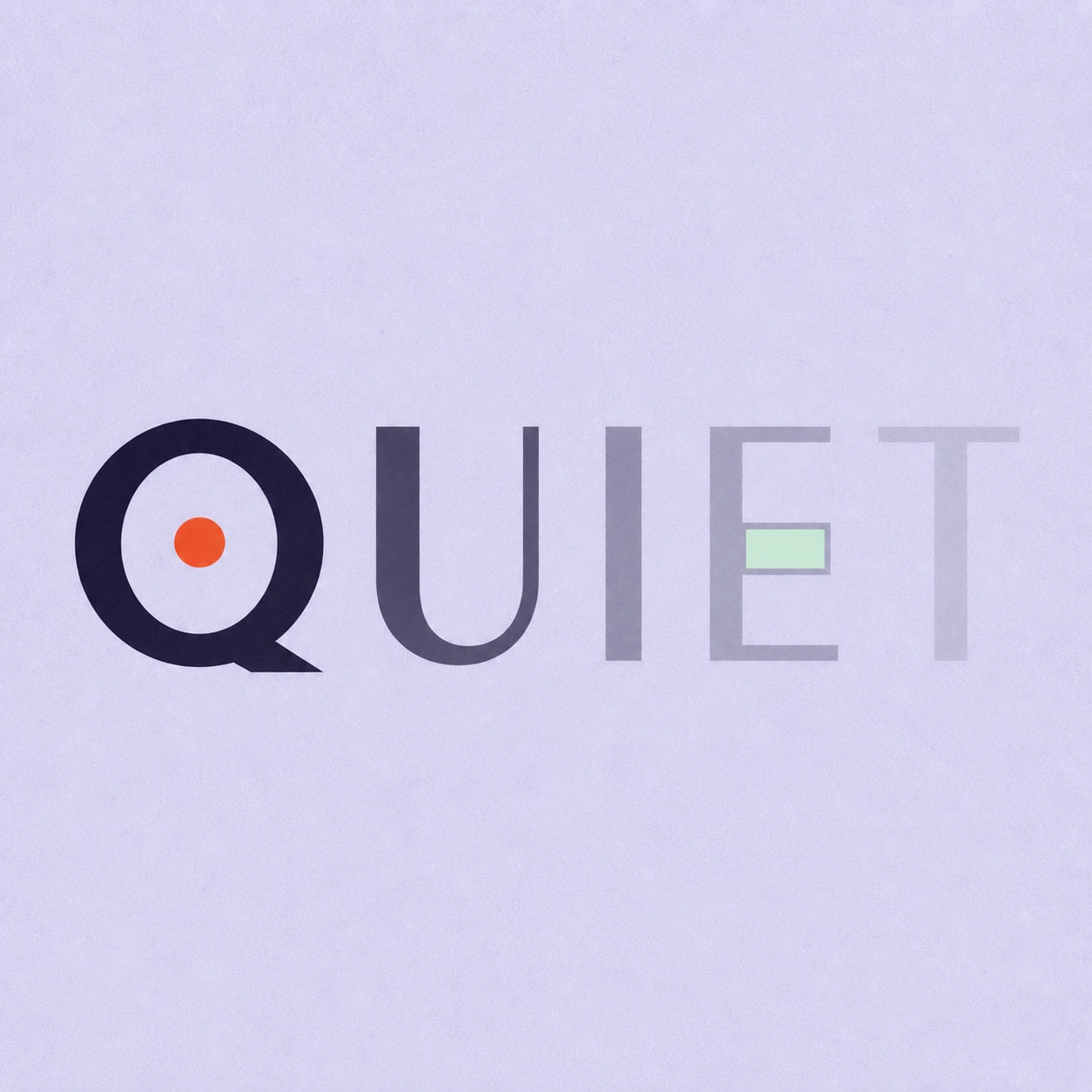
Silence is not empty. It is space kept deliberately.
Use this direction
A clear direction for an ambitious idea.
Use this directionFrom your text to a considered image.
- 01
Enter the exact label
Use the name or short phrase you intend to show, preserving case, spaces, accents and punctuation within 40 characters.
- 02
Set the ink direction
Choose a palette and continue to the Graphic poster brief. Describe a complete letter skeleton and the amount of ink wear you want.
- 03
Check both impressions
Read the small square, then inspect every stroke, counter and ink skip at full size before using the image.
Before you create.
How is this different from letterpress text?
This starter shows a flat, slightly uneven ink impression. The letterpress page focuses on inked letters with a shallow recess in continuous paper. Neither page supplies a production plate.
Can I order a physical rubber stamp from the result?
The result is a square artwork image, not a cut-ready stamp design. A stamp maker needs separate artwork sized to their process, with line widths and reversals checked for the intended material.
Does it create an official seal or approval mark?
No. It explores the visual texture of stamped lettering. Do not use an image as evidence of approval or authenticity; add any legitimate document markings through the appropriate process.
Will a Chinese name or punctuation stay intact?
The brief carries exact Unicode text within 40 characters. Inspect each radical, accent and mark after generation. If distress obscures a fine stroke, reduce the ink wear in Studio.