 Minglyph
Give the word a painted gesture.
Start with the wording you want to show, then explore a hand-painted ink character for it. Broad strokes and lighter finishing marks can bring movement to a title without losing its letters.
Free public preview · No sign-up required · See plans and downloads
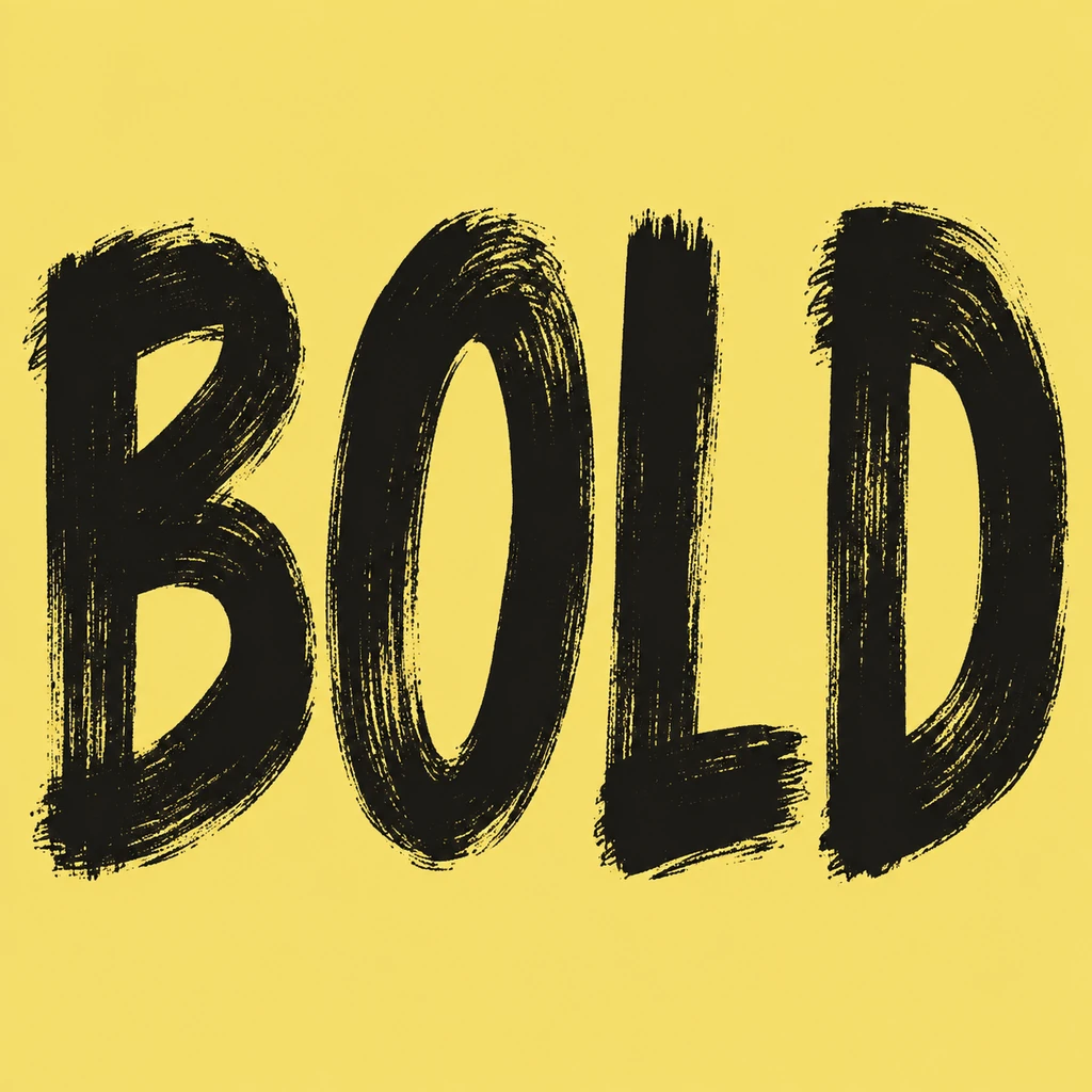
Make stroke contrast serve the letters.
The BOLD study uses heavier brush-like downstrokes and lighter ends inside four separate capitals. For your text, keep the thickest marks on the main letter skeleton and let thinner marks finish rather than replace a stroke. Read the word without its texture first. If a light crossbar disappears or a broad edge closes a counter, simplify the brush direction before asking for more energy.
Keep the painted edge under control.
A little dry edge can make ink feel handled, but flecks between glyphs may look like punctuation. Keep irregularity inside each complete character and preserve the space between words. This is a different problem from graffiti spray texture or watercolor washes: the brush mark is part of the stroke itself. Inspect dots, accents and narrow Chinese strokes separately so texture does not change their shape.
Judge it at the size people will see.
A brush title for a social tile needs a strong overall silhouette. Check the artwork as a small square before admiring the full-size stroke detail. Use the result as a headline image in a separate layout when you need dates or supporting copy. The image is not an editable brush font or a set of vector paths; keep ordinary text nearby when a selectable caption matters.
Another way to approach the letters.
Selected studies with their own briefs. Open a direction and replace the text with yours.
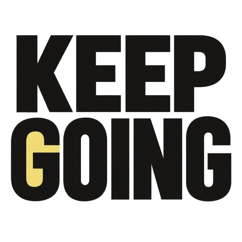
A small nudge for the work that matters.
Use this direction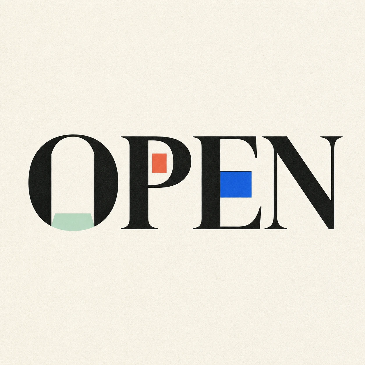
Possibility begins where a closed form gives way.
Use this directionFrom your text to a considered image.
- 01
Write the exact short text
Enter your chosen word or phrase, with the case, accents and punctuation you want visible.
- 02
Choose an ink mood
Select a palette and continue to the Graphic poster brief in Studio. Describe the amount of stroke contrast and edge texture you want.
- 03
Read it before sharing
Inspect the small image, then compare every complete stroke and mark against your input at full size.
Before you create.
Does this produce a brush font I can type with?
No. It produces an artwork image of your supplied text. It does not install a typeface, build a complete alphabet or export editable brush-letter paths.
Can I set brush pressure or pick a specific brush numerically?
The Studio uses an editable visual brief, not a pressure or brush-size slider. Describe a heavier main stroke or quieter dry edge, then review the next generated image.
Is this the same as watercolor or graffiti text?
This starter focuses on broad and light ink marks forming the letters. Watercolor explores translucent washes on paper; graffiti starts with angular blocks and restrained spray-painted edges.
Will it keep a Chinese name or mixed-language phrase?
The brief asks for your exact Unicode text within 40 characters. Check each radical, accent, space and punctuation mark in the image, especially where a thick stroke meets a small opening.