 Minglyph
Your words, with a painted edge.
Explore bold graffiti lettering for a digital title, a personal word image or a poster concept. Bring the wording you already want and give it a strong silhouette, distinct letter shapes and a little spray-painted texture.
Free public preview · No sign-up required · See plans and downloads
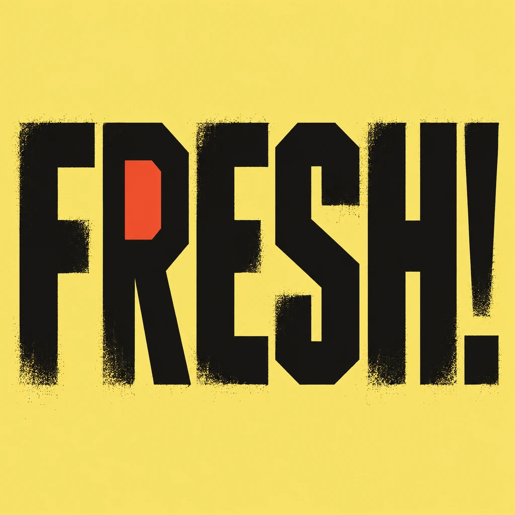
Build the word before adding the spray.
Start with the shape of each letter and the rhythm of the whole word. FRESH! uses tall angular blocks, a small color inset and open gaps between characters. For your wording, keep enough space to distinguish similar shapes such as E and F or P and R. A slant can add movement, but it should not hide the next letter. Read the complete phrase without relying on the decorative texture.
Keep texture away from the smallest details.
A restrained spray edge can suggest painted lettering without covering the image in scattered marks. Compare the rough areas with the solid strokes underneath: the paint must still complete the character. Check periods, accents and the dot of an exclamation mark separately. Loose flecks near those details can look like extra punctuation. This brief leaves out arrows, underlines and wall scenery so the supplied text remains the main subject.
Choose a lettering image for the intended layout.
A short title gives block letters room to stay distinct in a square. If you need a longer poster message, make the headline here and arrange dates, credits or supporting copy separately. Look at the artwork on a phone before choosing a version for a post. For a shirt concept, compare it against the garment color and prepare the final file to the printer’s requirements; a square painted image is only one part of that layout.
Another way to approach the letters.
Selected studies with their own briefs. Open a direction and replace the text with yours.
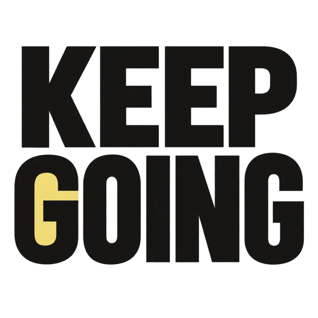
A small nudge for the work that matters.
Use this direction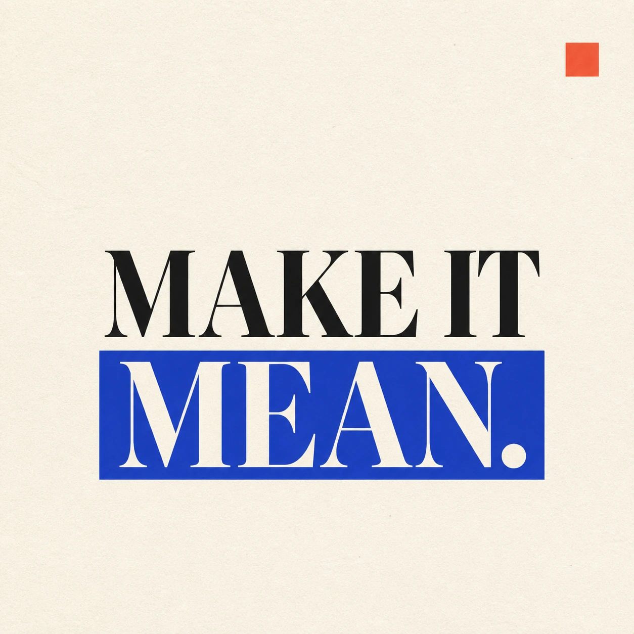
A strong visual rule makes a short statement land.
Use this directionFrom your text to a considered image.
- 01
Supply the exact wording
Use your own word, name or short phrase within 40 characters. Include the case and punctuation you want visible in the image.
- 02
Choose the color direction
Continue to the Graphic poster brief with your selected palette. Refine block weight, slant and edge texture in Studio.
- 03
Check the letters and punctuation
Inspect the full-size result and a small preview. Keep complete strokes, clear word order and distinct marks around every character.
Before you create.
Will it invent a graffiti name for me?
This page styles the words you supply. It does not propose a new name or tag. Enter wording you have already chosen, then explore how its letter shapes could look as an image.
Does this starter make interlocking wildstyle lettering?
It starts with readable, separate block letters and controlled painted edges. It does not promise interlocking wildstyle structures, shared strokes or decorative arrows. The focus is on keeping your exact wording recognizable.
Can I select a graffiti font or download editable outlines?
The workflow uses an editable visual brief to create a square artwork image. It does not provide a font picker, an installable typeface, vector letter paths or individually editable spray layers.
Can I keep a handle, punctuation or Chinese characters?
Yes. The brief accepts exact Unicode text within 40 characters. Check every @, period, accent and Chinese stroke after generation. Bold styling and rough paint edges must not merge characters or turn small marks into stray texture.