 Minglyph
Start with the words you would wear.
Build a T-shirt typography design around your own short phrase, team name or personal motto. Start with compact, bold lettering and clear word breaks, then refine the composition in Studio. The result is an artwork concept to review before preparing a final print file.
Free public preview · No sign-up required · See plans and downloads
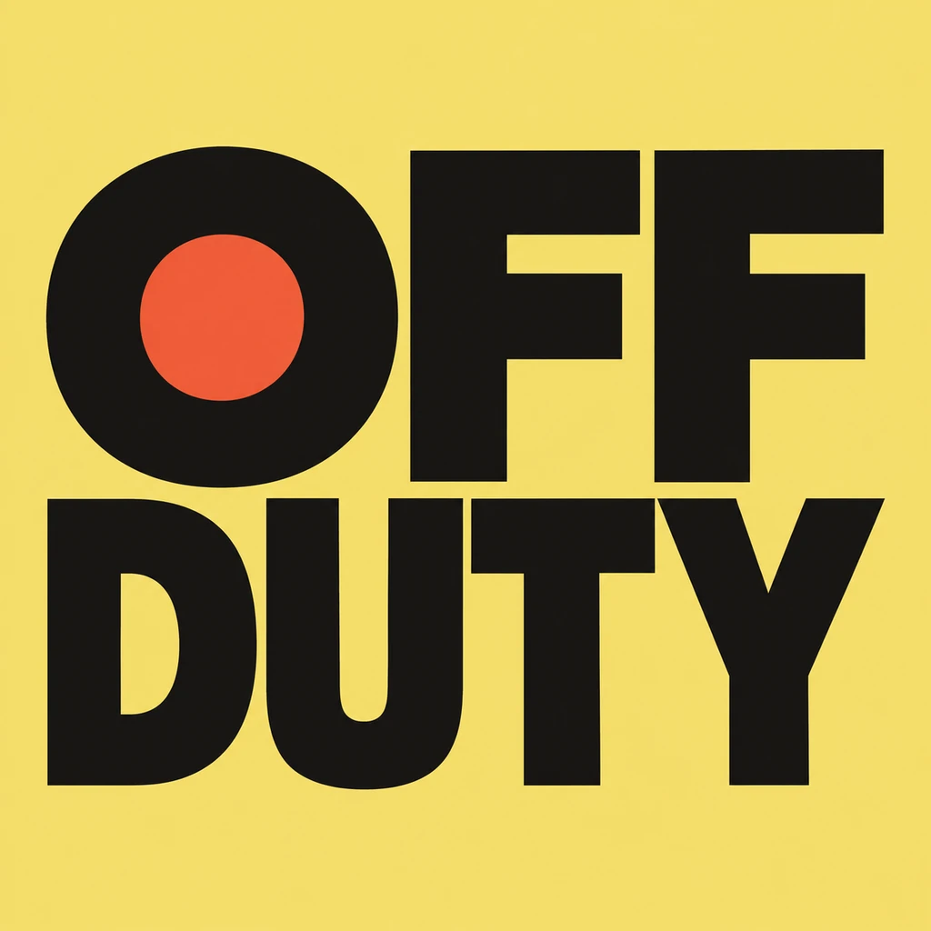
Make the phrase work at a glance.
Read the words aloud and decide which part should be noticed first. OFF DUTY forms a compact block because each word keeps its own line and the letters share a strong weight. For your phrase, break between complete words and leave space inside letters such as O, D and R. A small accent can carry the idea without adding another slogan or making the reading order ambiguous.
Think about the chest area.
A square image is a starting composition. Place the chosen concept in your garment template at the intended width, then look at the whole front from a distance. Check the space below the neckline, side seams and the shape of the text block. Compare it against the actual shirt color. A design that reads clearly in an isolated preview can become weak against fabric of a similar tone.
Prepare the chosen concept for printing.
This starter has an opaque background. Decide whether that rectangle belongs in the print or needs removing in an image editor. Check pixel dimensions at the intended physical size: a 1024-pixel-wide image spans about 3.4 inches at 300 pixels per inch. Changing a resolution label does not add detail. Use the printer’s product-specific requirements for the final size, transparency and color preparation, then review a proof.
Another way to approach the letters.
Selected studies with their own briefs. Open a direction and replace the text with yours.
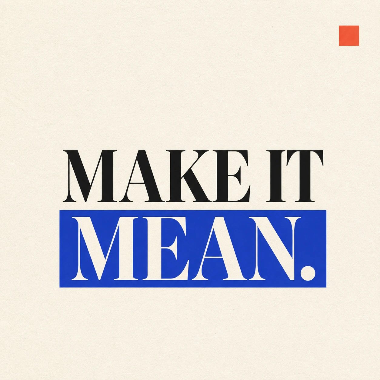
A strong visual rule makes a short statement land.
Use this direction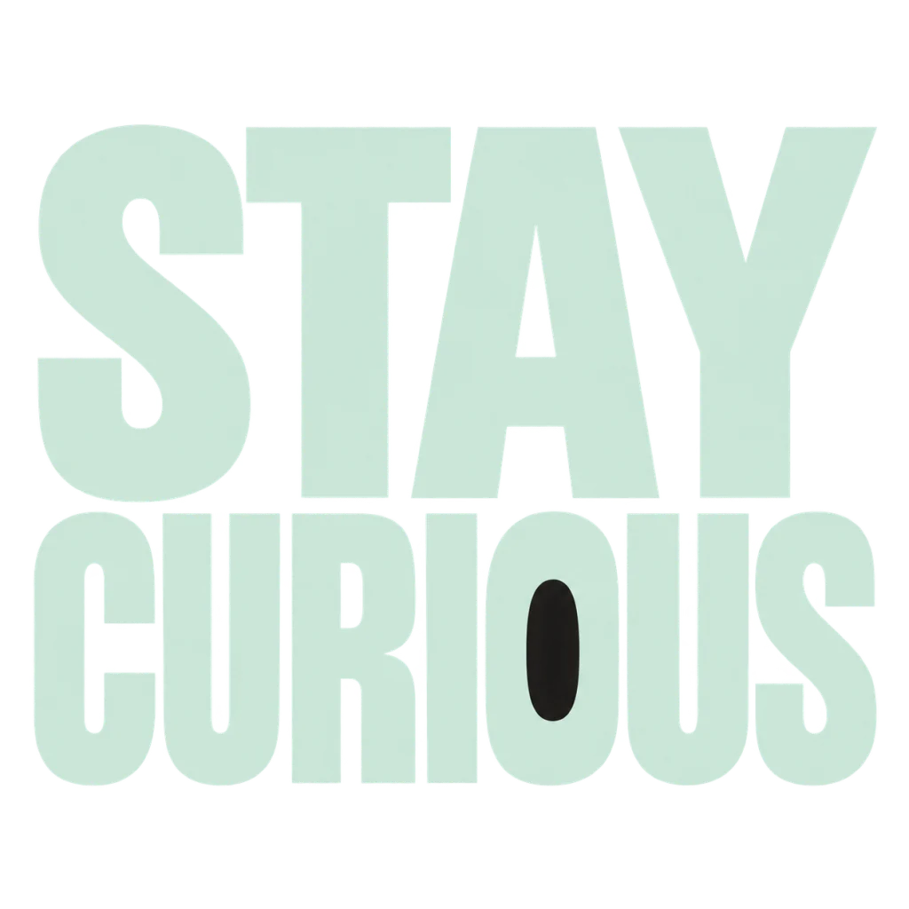
A reminder to leave the next question open.
Use this directionFrom your text to a considered image.
- 01
Write your own short phrase
Keep the text within 40 characters, including spaces and punctuation. Use deliberate word breaks when describing the layout in Studio.
- 02
Explore a compact composition
Start with Graphic poster and your chosen palette. Adjust the visual brief to emphasize one word or a stronger overall text block.
- 03
Review before making the print file
Check spelling, counters and contrast. Test the concept at its intended garment size and prepare the final file for your printer.
Before you create.
Can I print the generated design immediately?
Treat the result as an artwork concept first. Check the actual download dimensions, background and your printer’s file requirements. Large prints may need the lettering rebuilt or prepared at a higher resolution.
Does Minglyph show a real shirt mockup or sell the shirt?
This page creates a square typography artwork and opens its brief in Studio. Garment mockups, print placement, ordering and fulfillment are separate steps.
Can I use a team name, Chinese text or mixed lettering?
Yes. Enter the exact text you want within the 40-character limit. The brief supports names and mixed Unicode; inspect each character and punctuation mark before using the design.
Is the artwork transparent or an editable font?
This starter creates artwork on a background. It does not promise a transparent, layered or print-ready vector file, and it does not create an installable font. Check the available Studio downloads and prepare the chosen design for its final use.