 Minglyph
Let the dots live inside the letters.
Turn a short title or name into a print-inspired lettering image. Begin with complete letter shapes, then use a controlled field of dots to give the word its texture without changing its spelling.
Free public preview · No sign-up required · See plans and downloads
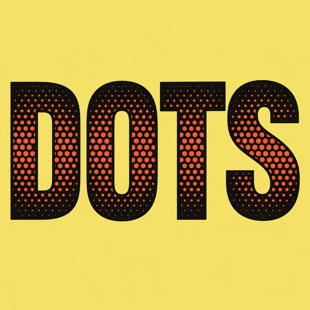
Draw the solid word before adding dots.
The DOTS study starts with four broad letter silhouettes. Their edges and counters still explain the word when the small red dots are ignored. Begin with a short, heavy title and keep a solid outer edge around each glyph. If the pattern breaks an E bar, closes an O or creates a mark that looks like punctuation, reduce the dot density and restore the letter skeleton.
Use the pattern at the size of the final image.
At a large view, individual dots give the lettering a printed rhythm. At phone size, many dots merge into a tone. Check both views and choose a density that supports the word rather than competing with it. A quiet, flat background keeps the image from becoming an all-over texture. This page explores the visual effect; it does not set an exact screen angle, line frequency or ink separation for a press.
Place the lettering in your own layout.
A square halftone title can anchor a zine cover, social tile or print-inspired announcement. Keep dates, credits and longer body copy in a separate layout so the artwork remains a clear typographic subject. The download is an image with its own background, not an editable font, transparent overlay or production-ready halftone plate. Ask a printer for the actual resolution and separation rules before physical output.
Another way to approach the letters.
Selected studies with their own briefs. Open a direction and replace the text with yours.
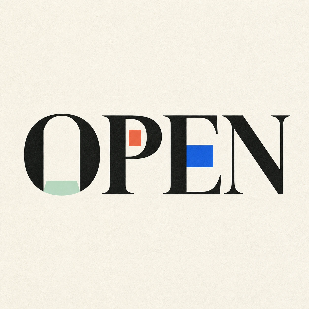
Possibility begins where a closed form gives way.
Use this direction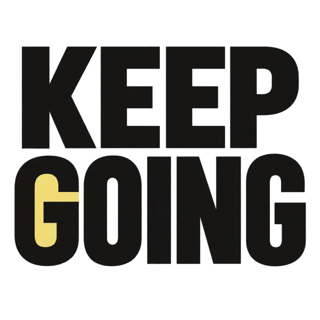
A small nudge for the work that matters.
Use this directionFrom your text to a considered image.
- 01
Enter the exact wording
Use a short word or title, preserving case, spaces, accents and punctuation within the 40-character limit.
- 02
Choose a color field
Select a palette and continue to the Graphic poster brief. Describe the dot fill and how much solid letter edge should remain.
- 03
Compare two viewing sizes
Read the small square first, then inspect dots, counters and every required mark at full size before downloading.
Before you create.
Is this the same as comic action lettering?
No. This starter treats halftone dots as a texture contained inside the letterforms. The comic page centers on an impact silhouette around a short action word and its punctuation.
Can I specify a precise print screen or CMYK separation?
No. Studio uses a written visual brief and produces a square image. It does not expose numeric screen frequency, dot angle, separations or press-ready plates. Prepare those with the intended printer.
Does it turn my text into decorative Unicode symbols?
No. Enter the wording you want pictured. The brief asks for the exact Unicode sequence, rather than adding dot characters around each letter. Inspect the generated image before using it.
Will Chinese characters and punctuation remain legible?
The brief accepts exact Unicode text within 40 characters. Check every radical and mark at both large and small sizes; a dense texture may need to be simplified around fine strokes.