 Minglyph
Give the sound effect a strong silhouette.
Start with a short exclamation, name or title you have already written. Explore bold comic lettering as one square image, with the words still readable before the impact shape draws attention.
Free public preview · No sign-up required · See plans and downloads
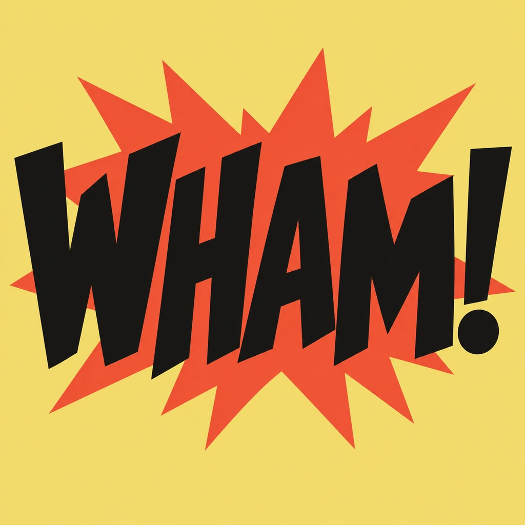
Let the letters deliver the impact.
The WHAM! study begins with a compact row of angular capitals. A single shape behind them echoes their angles without replacing a stroke. Try reading the word with the background detail ignored: if the letters cannot carry the action alone, simplify their silhouette before making the shape louder. Keep the exclamation stem and dot visibly separate from both the last letter and the background.
Check the smallest panel-sized view.
Comic lettering often appears among drawings, speech and motion. Compare your image as a small square before judging its full-size texture. A thick edge can help a short sound effect hold together, while too many spikes or marks can make punctuation look accidental. Keep every glyph complete inside the frame, and give the word enough margin to survive a later crop in your own layout.
Use it as one part of a comic layout.
A standalone lettering image is a useful direction for a title card, social tile or panel sound effect. Place the selected image into your page layout separately and check whether its opaque background suits that page. This starter does not write dialogue, edit an uploaded panel, draw speech balloons or produce an installable comic font. Longer conversations should stay as editable text in the comic editor.
Another way to approach the letters.
Selected studies with their own briefs. Open a direction and replace the text with yours.
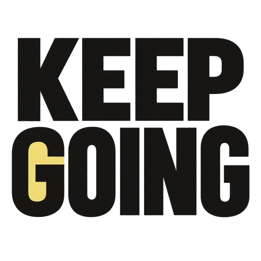
A small nudge for the work that matters.
Use this direction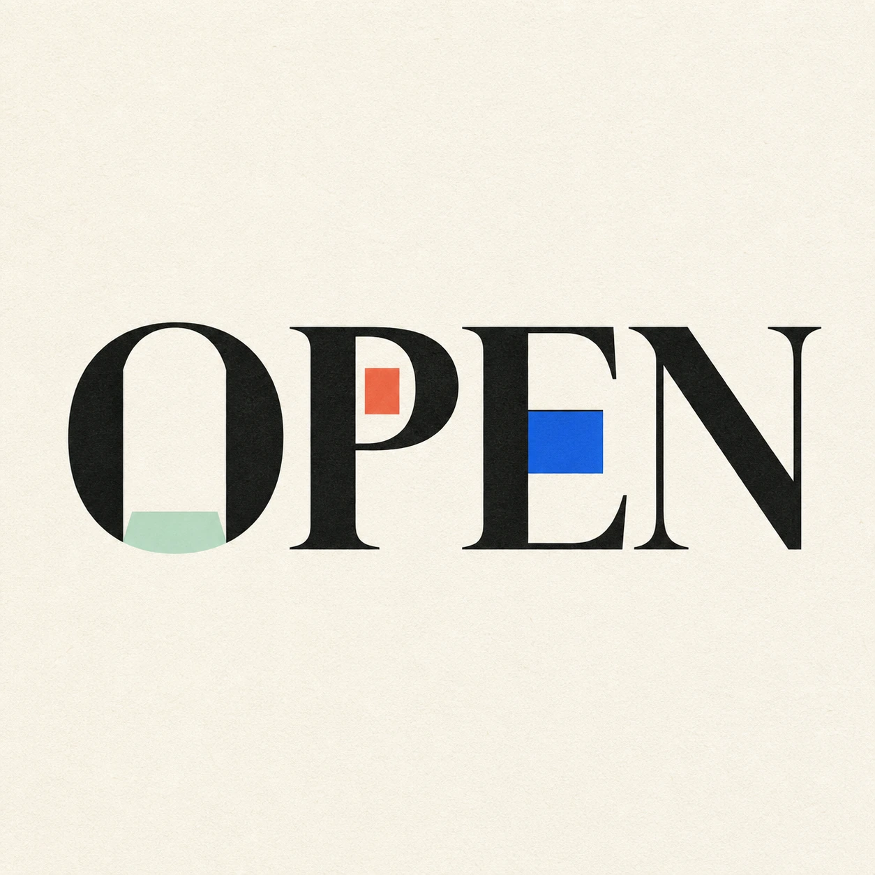
Possibility begins where a closed form gives way.
Use this directionFrom your text to a considered image.
- 01
Type the exact short text
Enter the word, title or exclamation with the case and punctuation you need. Short wording leaves room for the full letter shapes.
- 02
Choose a color direction
Select a palette and continue to the Graphic poster brief in Studio. Refine the weight, letter angles and one contained impact shape.
- 03
Review before placing it
Compare each glyph and punctuation mark with your input, then check the square image at the size it will occupy in your layout.
Before you create.
Will this create a full comic panel or speech bubble?
No. It creates a square lettering artwork for your supplied text. Drawings, panel borders, dialogue and speech balloons belong in a separate comic layout tool.
Can I use an exclamation mark or Chinese characters?
The brief accepts exact Unicode text within 40 characters. Inspect every radical, accent and punctuation mark after generation; a bold impact shape must not conceal a small mark.
Can I pick a comic font or export editable lettering?
This workflow uses an editable visual brief to generate an image. It does not offer a font picker, a complete typeface, editable letter paths or a transparent text layer.
How is this different from graffiti or retro text?
This page focuses on a short action word with a controlled impact silhouette and clear punctuation. Graffiti uses spray-edged block letters; retro uses rounded display letters with a short flat offset shadow.