 Minglyph
Let a short reading message fit the bookmark.
Choose an original phrase or an authorized title, then explore its lettering as one image component. Set the actual bookmark dimensions in a layout editor before judging it. Leave the author, website and other details as editable text, and print a rough actual-size copy before planning a larger batch. The Minglyph concept is square artwork, rather than a finished bookmark or a print-ready file.
Free public preview · No sign-up required · See plans and downloads
Make one phrase the first reading.
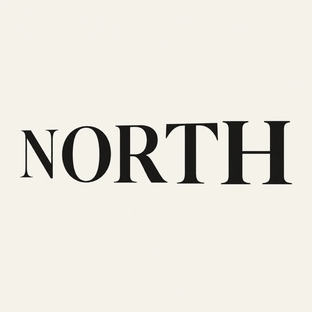
A narrow bookmark can make several short lines feel crowded. Begin with a small amount of wording and a clear top-to-bottom order. Keep punctuation and word spaces deliberate. If the book name is longer, compare a shorter authorized phrase with the full title set separately in editable text. Keep the gift recognizable without asking every line to carry the same visual weight. NORTH is an earlier owned name study reused as a short-title reference. Its five serif letters show a quiet reading line; it is not a published book, a new bookmark commission or proof of print quality. Compare the book title in its cover layout.
Place the square inside the narrow format.
Use the artwork as a component on your chosen bookmark canvas instead of stretching it into a tall rectangle. Preserve the complete letters and leave enough room around them for the final trim. A separate reverse-side identity can hold practical information when the front should remain quiet. A colored square is not a transparent mark, a dieline or a cutting file. Compare a quieter name-led treatment.
Proof the small print, then make a series.
Inspect the downloaded image at full size and print a rough copy at the intended bookmark dimensions. Check narrow strokes, counters, punctuation and the balance with the editable details. Keep one useful proportion or palette across later gifts; inspect the new wording again rather than assuming the earlier result will fit. Confirm the printer's requirements for the final layout, paper, margins and file format separately. Compare restrained ink and paper detail.
Another way to approach the letters.
Selected studies with their own briefs. Open a direction and replace the text with yours.
A clear voice for a thoughtful brand.
Use this direction
A clear direction for an ambitious idea.
Use this directionFrom your text to a considered image.
- 01
Choose exact authorized wording
Use a short original phrase or a book title you have permission to use. Preserve spaces, punctuation and Unicode.
- 02
Explore a restrained title image
Keep the word complete, with readable counters and comfortable margins.
- 03
Build a narrow layout and proof it
Add separate editable details and print an actual-size draft before preparing production files.
Before you create.
Does this generate a finished bookmark?
It generates a square lettering concept. Finish the narrow canvas, supporting details, reverse side and production file in a separate layout tool.
Can I use a long quotation?
This starter works best with a short phrase. Set longer authorized text as editable type in the final layout, rather than relying on a crowded image.
Are cutting paths or a print-ready PDF included?
No. The PNG concept does not provide a dieline, a cutting file, bleed settings or a printer-approved PDF.
Can I use Chinese or mixed-language wording?
Use the exact supplied Unicode and inspect every stroke, punctuation mark and space at full size and the intended print size.
Can I reuse the idea for a series?
You can keep the brief or palette as a starting point. Check each new wording at full size and the intended printed size before reusing the layout.
Why is NORTH shown?
NORTH is an owned September 18 wordmark concept reused as a short-title reference. Keep its square background intact when placing it in a narrow layout. It is not a measured bookmark or a newly generated image.