 Minglyph
A little chalk. A clear message.
Give a daily special, a classroom heading or a short announcement the feel of hand-drawn chalk. Start with your wording and a palette, then explore broad strokes and a lightly worn surface in Studio.
Free public preview · No sign-up required · See plans and downloads

Put the chalk texture inside the letters.
The TODAY study keeps a solid reading shape beneath fine breaks in the pigment. That balance matters: a few gaps suggest a dry chalk stroke, while large holes can erase a crossbar or turn punctuation into dust. Begin with broad lettering and open counters. Ask for less grain if the word only becomes clear when you enlarge it. The texture should reward a close look without making the small view harder to read.
Leave the board quiet around the message.
A dark field gives pale chalk a clear edge. Check that contrast before adding surface wear, then keep any variation away from small accents and the space between words. Frames, arrows and decorative flourishes can compete with a short announcement, so this starter leaves them out. For a café special, try the dish name alone; for a classroom image, use the topic heading. Add prices, dates or instructions as separate editable text in your final layout.
Review the image where people will see it.
A chalk heading used on a phone needs a stronger silhouette than a large mood-board image. Shrink the result to the intended display size and read it without referring to your original input. Then zoom in to check character shapes, punctuation and stray marks. If you plan to redraw the idea on a physical board, use the image as a visual reference and plan the board dimensions and supporting information separately.
Another way to approach the letters.
Selected studies with their own briefs. Open a direction and replace the text with yours.
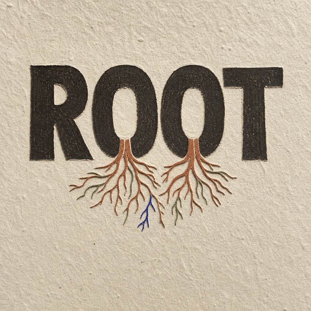
What holds us up is often the part no one sees.
Use this direction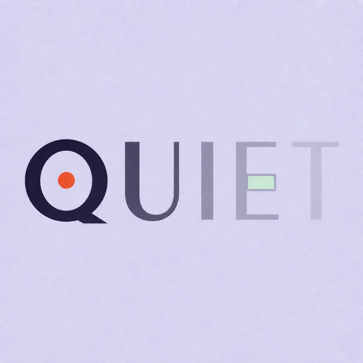
Silence is not empty. It is space kept deliberately.
Use this directionFrom your text to a considered image.
- 01
Enter the exact heading
Use up to 40 characters, including spaces and punctuation. Keep supporting menu items or classroom notes for a separate layout.
- 02
Set the chalk direction
Choose a palette and continue to Studio. The Organic brief starts with broad chalk strokes, open counters and a quiet matte board.
- 03
Check the strokes and the small view
Inspect every letter at full size, then reduce the preview. Keep the version whose wording reads before its texture.
Before you create.
Does this make a full chalkboard menu?
It creates one square lettering image from a short heading. It does not lay out a complete menu, keep prices editable or generate a physical sign. Arrange supporting information separately after choosing the lettering.
Can I copy and paste the chalk effect into a caption?
The chalk texture is part of an image. It is not a Unicode font substitution or copy-and-paste text effect. Use the artwork in a visual post and keep the caption as ordinary text.
Can I change the chalk and board colors?
You can select a different palette before opening Studio and refine the brief there. The Ink example uses pale lettering on a dark board. Check the generated contrast; the image generator does not expose separate exact color controls for each stroke.
Can I use accents, Chinese characters or a mixed-language heading?
Yes. The brief accepts exact Unicode text within 40 characters. Review every accent, punctuation mark and Chinese stroke after generation, especially where chalk gaps cross a small detail.