 Minglyph
Give the exhibition a clear point of entry.
An exhibition title introduces the work before a visitor reaches the first label. Explore a short title as square lettering artwork, then test it in a measured entrance layout. Keep the interpretation, artist names and practical information as actual text. Minglyph helps you choose a title-image direction; it does not design the installation or produce a wall-lettering file.
Free public preview · No sign-up required · See plans and downloads
Decide what the title needs to introduce.
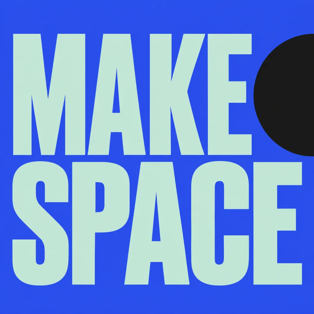
Agree on the exact title with the exhibition team before exploring its appearance. A concise phrase can establish a theme without trying to summarize every artwork. Keep a subtitle or an interpretive paragraph separate, where it can be edited and checked. MAKE SPACE is an owned September 18 poster study reused as a possible exhibition-title reference. It is not a museum commission, an installed sign or a new image made for this page. Compare a title-led poster composition.
Build the entrance in proportion before judging the image.
Draw the intended wall or panel area in your layout tool and place the square artwork proportionally, including its background. Compare the title with the introduction, credits and nearby work. Look at a rough physical proof from likely approach positions rather than judging only a close view on a laptop. A title that reads in a square preview may need a different scale or simpler construction in the room. Keep an actual-text version available for accessible information and alternative formats.
Give the supporting information its own hierarchy.
Keep artist names, dates, opening times and venue information in editable type. Check the wording with the responsible team and avoid embedding a whole label inside the generated image. If you also need a flyer, compose that separately: the flyer has to carry practical facts at a small size, while the entrance title identifies an exhibition in a physical space. Neither version should force visitors to read decorative lettering for the only copy of essential information. Plan the separate event flyer title.
Resolve production with the installer after choosing a direction.
The output is a square PNG concept. It is not a vinyl cutting path, vector outline, dimensioned sign or installation specification. Check the downloaded pixels against the intended use; rebuild the selected lettering in suitable production artwork if needed. Confirm material, dimensions, contrast, mounting and any venue requirements with the designer or installer. Reusing the title on a catalogue or website also needs its own size check rather than an enlarged copy of the preview. Review a name across several sizes.
Another way to approach the letters.
Selected studies with their own briefs. Open a direction and replace the text with yours.
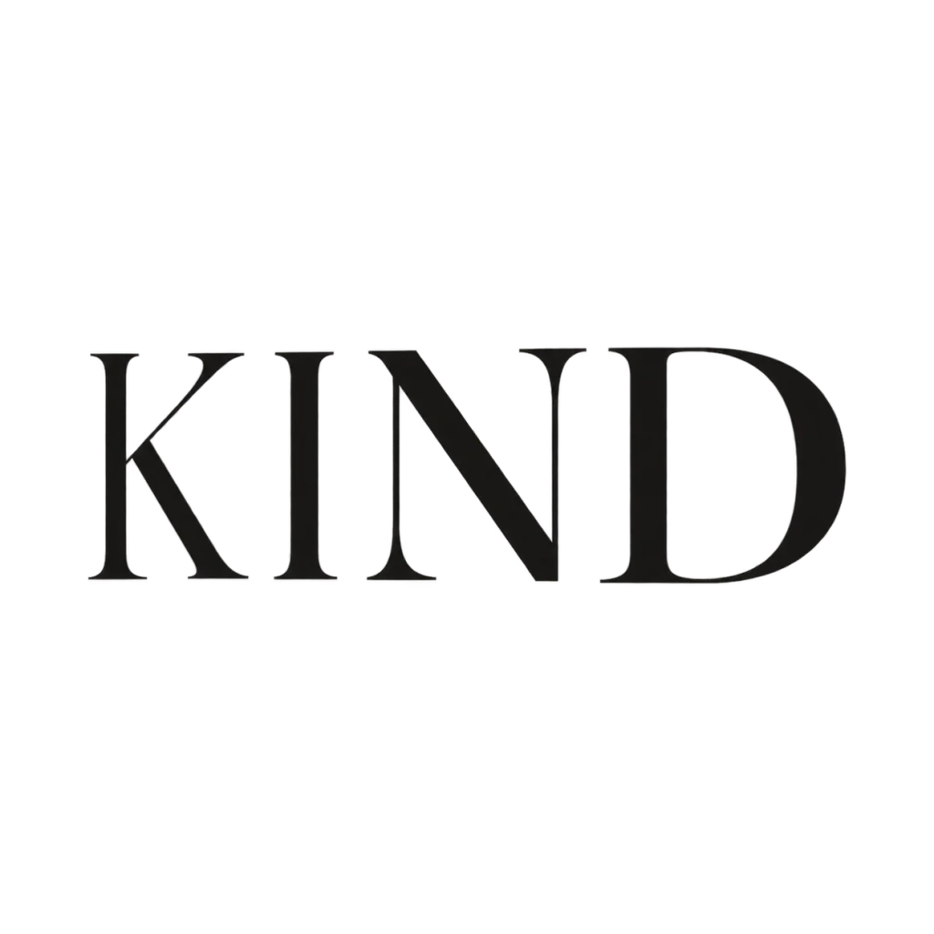
A clear voice for a thoughtful brand.
Use this direction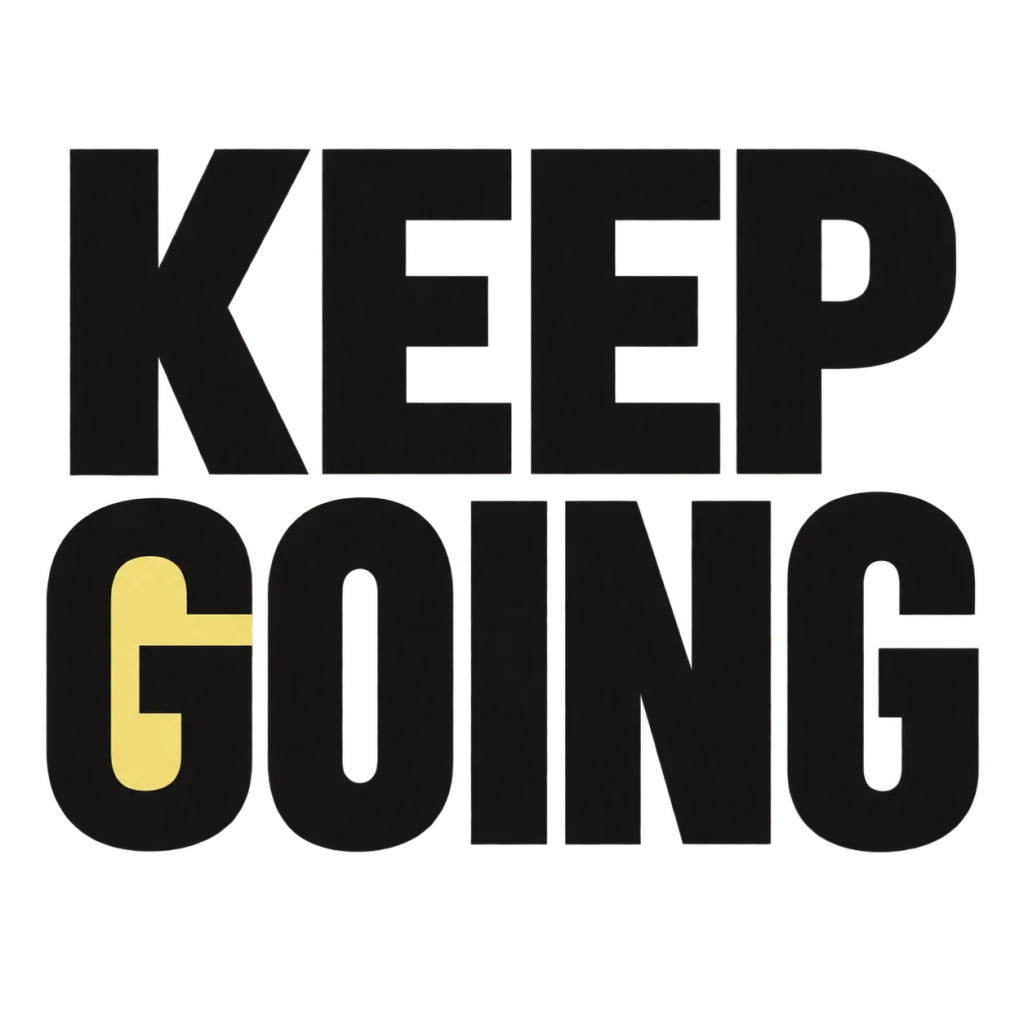
A small nudge for the work that matters.
Use this directionFrom your text to a considered image.
- 01
Use the agreed exhibition title
Enter the exact short wording within 40 characters. Keep the interpretation and practical details outside the image.
- 02
Explore a focused lettering idea
Choose a palette and continue to Studio. Preserve the complete title, word breaks, punctuation and clear counters.
- 03
Test the entrance and hand over the concept
Place the image in a measured layout, inspect a physical proof and prepare any separate production artwork with the installation team.
Before you create.
Does this make ready-to-install wall lettering?
It creates a square AI lettering concept. A designer or installer must prepare the appropriate production file, measurements, material and installation method separately.
Can I use a long exhibition introduction?
Keep the generated image to a short title within the 40-character starter limit. Set the longer introduction and object labels as actual editable text.
Is the download a vector or vinyl cutting file?
The artwork is a PNG image. It is not a vector tracing, font file or cutting path; check the separate text-reference export limitations before planning fabrication.
How should I judge readability in the gallery?
Compare the complete title and supporting text in the intended layout, then review a physical proof from likely visitor positions. This workflow does not certify exhibition accessibility.
Can the title contain Chinese or mixed Unicode?
Supply the exact characters, spaces and punctuation. Inspect every result carefully and keep the approved wording in the separate text information as well.
Was MAKE SPACE generated for an actual exhibition?
No. It is an owned September 18 poster study reused as a title-direction reference. No installation, museum endorsement or tested large-format print is claimed.