 Minglyph
Make the event name the first clear read.
Explore bold lettering for a workshop, gathering or independent show. Start with the exact short title, then place the image beside editable date, place and action text to judge the whole flyer.
Free public preview · No sign-up required · See plans and downloads
Give the title one job in the hierarchy.
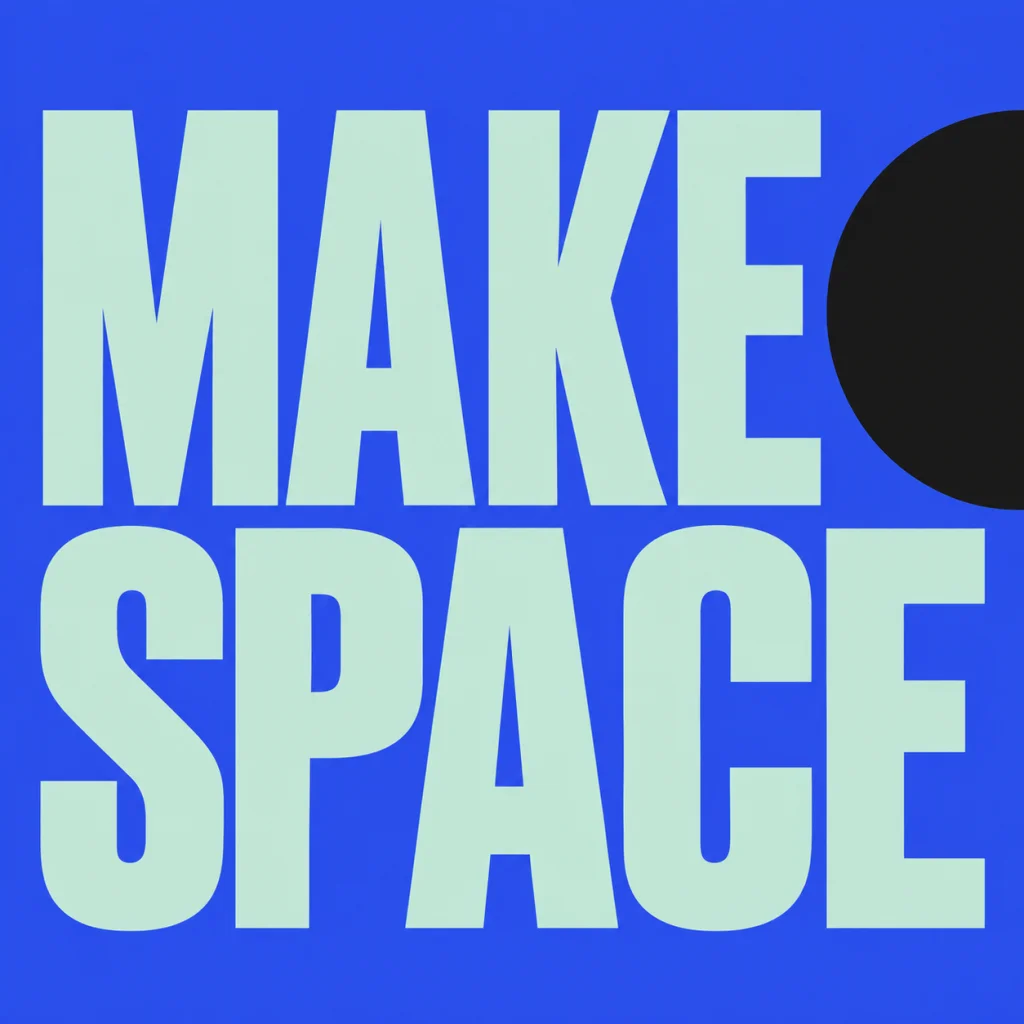
Decide what people should notice first, then keep the title shorter than the supporting information. The MAKE SPACE example is an earlier invitation-style typography study, with complete words arranged in two strong reading lines. It can suggest the voice of a workshop without inventing a real event. Dates, times, ticket links and venue details belong in the layout as separately editable text, where they can be checked and updated. Compare a message-led typography poster.
Review the lettering inside the real flyer.
Build a rough portrait or digital flyer around the square artwork in a layout editor. Compare the title proportions, open space and readability together with the supporting text. Do not stretch the square to fill a portrait sheet. View the whole composition small first, then inspect exact wording at full size. A loud title should help the reader find when, where and how to attend rather than push those details out of view. Compare a compact action-word treatment.
Proof the facts beyond the image.
Read the finished event name, date, time, place and call to action in their final order. Check actual links and include a text version when publishing an image flyer online. Print a proof at the intended size if the piece is for paper, and use your printer's specifications for the final layout. A PNG title concept does not supply measured print margins, bleed, a finished accessible PDF or a guaranteed complete event poster.
Another way to approach the letters.
Selected studies with their own briefs. Open a direction and replace the text with yours.
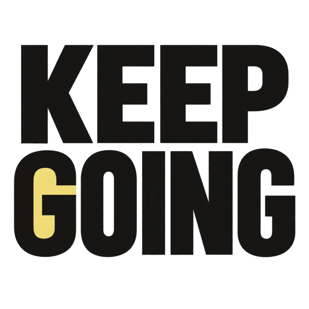
A small nudge for the work that matters.
Use this direction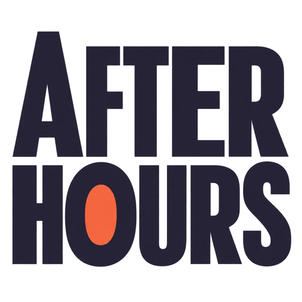
A cover for the hours that feel like your own.
Use this directionFrom your text to a considered image.
- 01
Use only the headline
Enter the exact event name or short invitation within 40 characters. Leave the practical information for the layout editor.
- 02
Choose a clear visual emphasis
Pick a palette and refine the Graphic poster brief in Studio. Ask for intact words and a reading order rather than a copy of another event's poster.
- 03
Check the entire information sequence
Place the PNG in the rough flyer. Review size, whitespace, contrast, event facts and clickable next steps together before publishing.
Before you create.
Does this generate a complete event flyer?
It creates a square AI lettering image for exploring the event title. A complete flyer needs its own layout, date, time, location, action text, contact information and final export review.
Can it generate dates and venue details accurately for me?
Supply and verify those facts yourself. Keep them as editable text in the final layout rather than relying on generated lettering for changing event details.
Why is MAKE SPACE shown?
MAKE SPACE is an earlier owned invitation-style typography concept reused here as a headline example. It is not a new event commission, a real workshop announcement or a newly generated image.
Can I use a Chinese or mixed-language title?
Yes. Enter exact Unicode within 40 characters, including intended spaces and punctuation. Check the character structure and reading order at the size where the flyer will be seen.
Can I get a portrait print-ready file or edit individual letters?
The current output is a square lettering image. It does not export a measured portrait layout, bleed settings, editable glyphs or font files. Finish the chosen title and all practical information in a separate layout tool.