 Minglyph
A thin surface. A warm impression.
Create a title or name image that suggests pressed gold foil. The interest comes from a small change in surface light, while the complete word stays easy to read against a quiet field.
Free public preview · No sign-up required · See plans and downloads
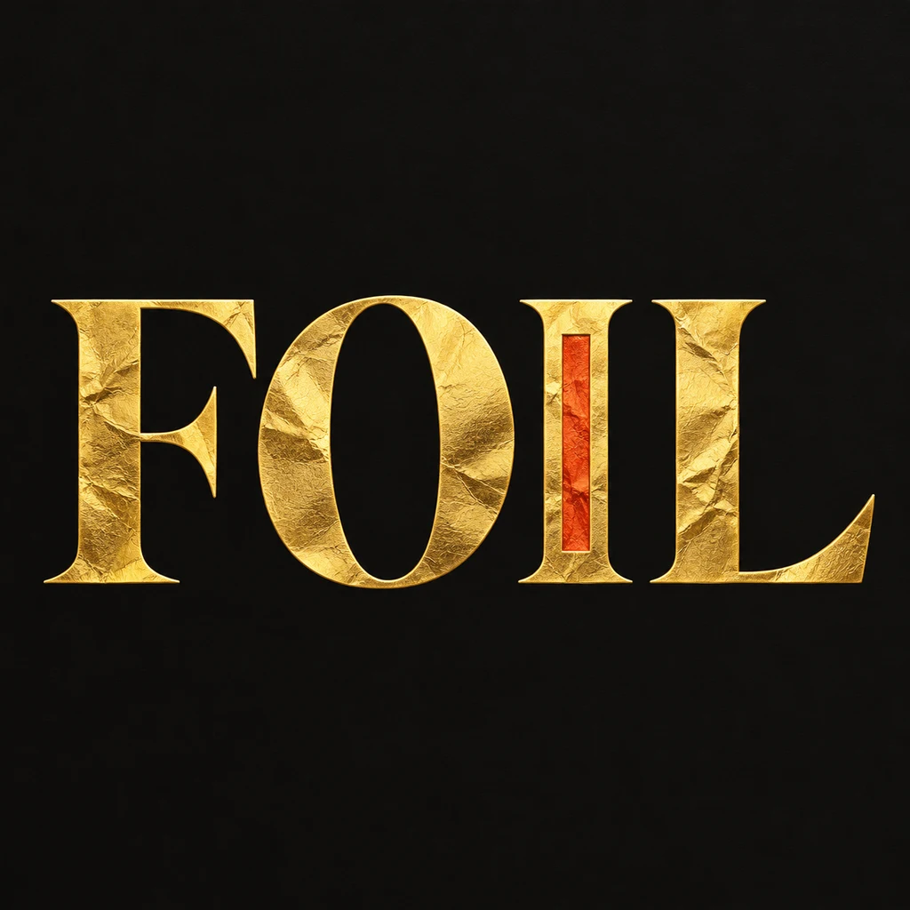
Distinguish foil from yellow ink.
The FOIL study uses broad serif faces so a little surface grain can remain visible. A thin highlight and a few contained creases suggest a sheet pressed onto the letter shape. Keep that texture inside the glyphs: a sparkle field around the word changes the subject to glitter, while a heavy bevel makes it look like a solid metal object. Start with nearly flat lettering and one light direction.
Keep small letters from dissolving.
Texture can erase a fine crossbar or turn a narrow counter into a dark patch. Read the image at the actual size of a cover thumbnail or invitation title before inspecting its surface at full size. If the word loses clarity, ask for wider stems, less grain or more space between letters. A dark surrounding field gives the pale foil a readable edge; compare a lighter palette only after the structure works.
Separate the concept from the printing process.
This is a square image for exploring a greeting, title or packaging direction. It does not contain a spot-foil plate, a physical metallic layer or an editable typeface. For a printed invitation or label, take the selected concept to a designer or printer and rebuild clean lettering to their production requirements. Keep supporting dates and addresses as editable text in a separate layout. Compare raised paper lettering.
Another way to approach the letters.
Selected studies with their own briefs. Open a direction and replace the text with yours.

A clear voice for a thoughtful brand.
Use this direction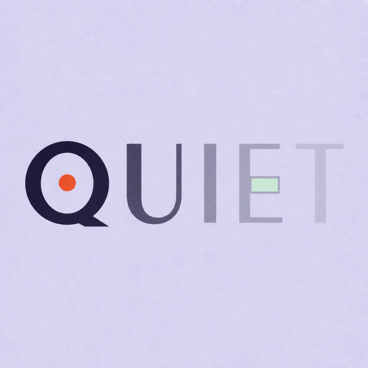
Silence is not empty. It is space kept deliberately.
Use this directionFrom your text to a considered image.
- 01
Enter the exact wording
Use a concise name or title with the final capitalization and punctuation. Short text leaves room for a visible surface without crowding.
- 02
Choose a palette and a surface
Continue to Studio with the Editorial brief. Describe thin foil and restrained highlights; the sample uses warm butter-yellow foil on near-black.
- 03
Read first, inspect second
Check the small word without looking at the input, then inspect every counter, serif and mark at full size. Keep only a result that carries the exact text.
Before you create.
Is this real foil printing or a print-ready foil plate?
No. Minglyph generates an AI image suggesting a foil surface. Printing separations, vector reconstruction and the printer’s minimum stroke requirements are separate work.
How is gold foil different from chrome lettering?
This starter emphasizes a thin, lightly textured surface with restrained light. The chrome study emphasizes reflective silver bands and a hard metal edge. They are different image directions, not selectable manufacturing materials.
Can I use this on an invitation or a label?
Use it as a concept or an image element after checking dimensions and legibility. Add precise event or product information in a layout editor, and check the final printing requirements separately.
Can I control the exact foil color and grain?
Choose a palette and edit the written direction in Studio. There are no numeric foil, roughness or print controls; generated details can vary. The exact Unicode brief supports names and mixed-language text, but every stroke must be reviewed.