 Minglyph
Let the paper lift the letters.
Explore a raised-paper treatment for a name, short title or stationery idea. One continuous sheet, shallow relief and a consistent light direction give the wording its form without relying on ink.
Free public preview · No sign-up required · See plans and downloads
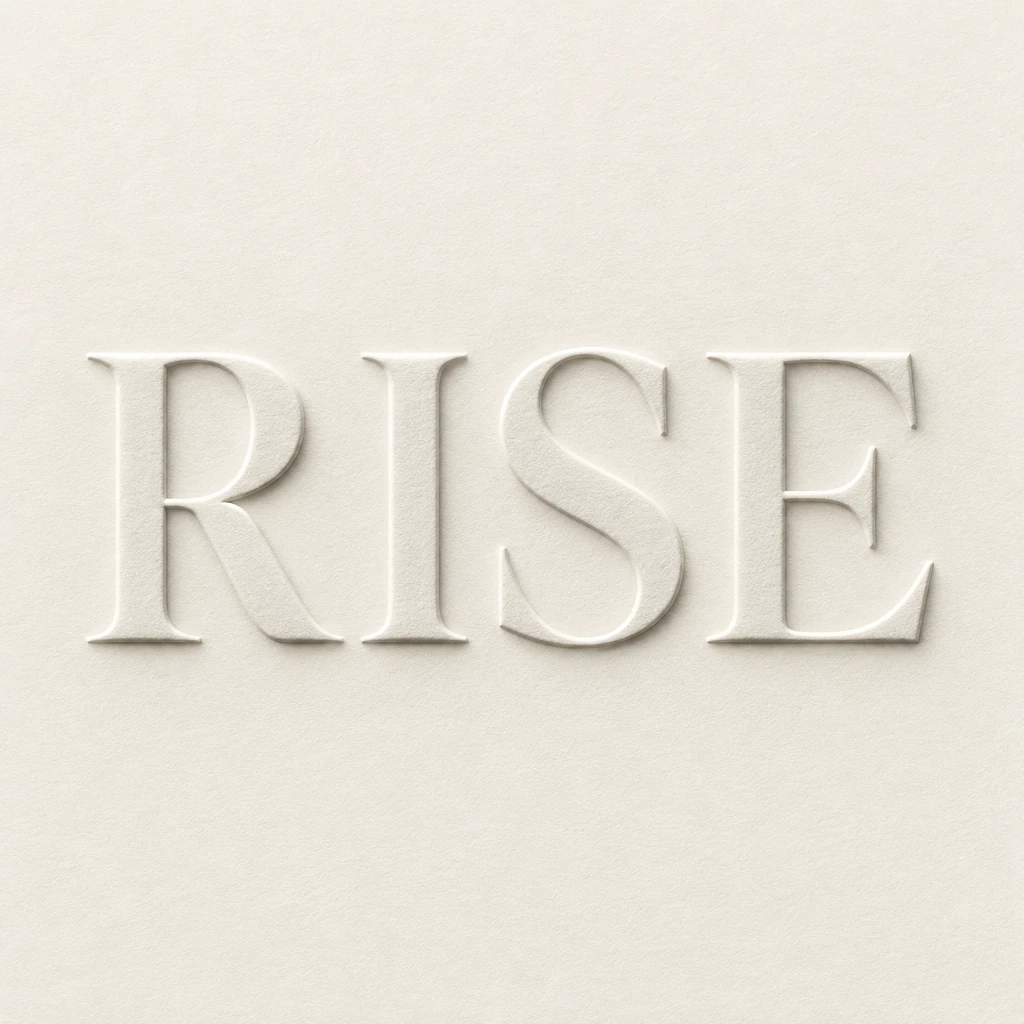
Let light explain the raised edge.
The RISE study asks for pale letter faces on the same warm paper as the surrounding field. A narrow highlight on one side and a soft gray shadow on the other describe the change in height. Keep that light direction consistent from one letter to the next. If shadows appear on both sides at random, the word may read as a cutout or a photograph of separate objects instead of relief in a sheet.
Leave enough room inside every letter.
Embossing becomes less legible when a narrow counter fills with shadow. Start with a short word and broad enough strokes to carry both the letter shape and the relief edge. Check the opening in R and the spaces between neighboring letters before adding stronger texture. At phone size, the entire word should read even if the fine paper fibers disappear.
Treat a visual study as a print reference.
This image can help choose a paper mood, word shape and apparent depth for a stationery concept. Physical embossing needs production artwork and a printer’s specifications for the stock, die and separate mask. Use the image as a discussion reference; its highlights and shadows do not measure a real impression or supply a die-ready file.
Another way to approach the letters.
Selected studies with their own briefs. Open a direction and replace the text with yours.
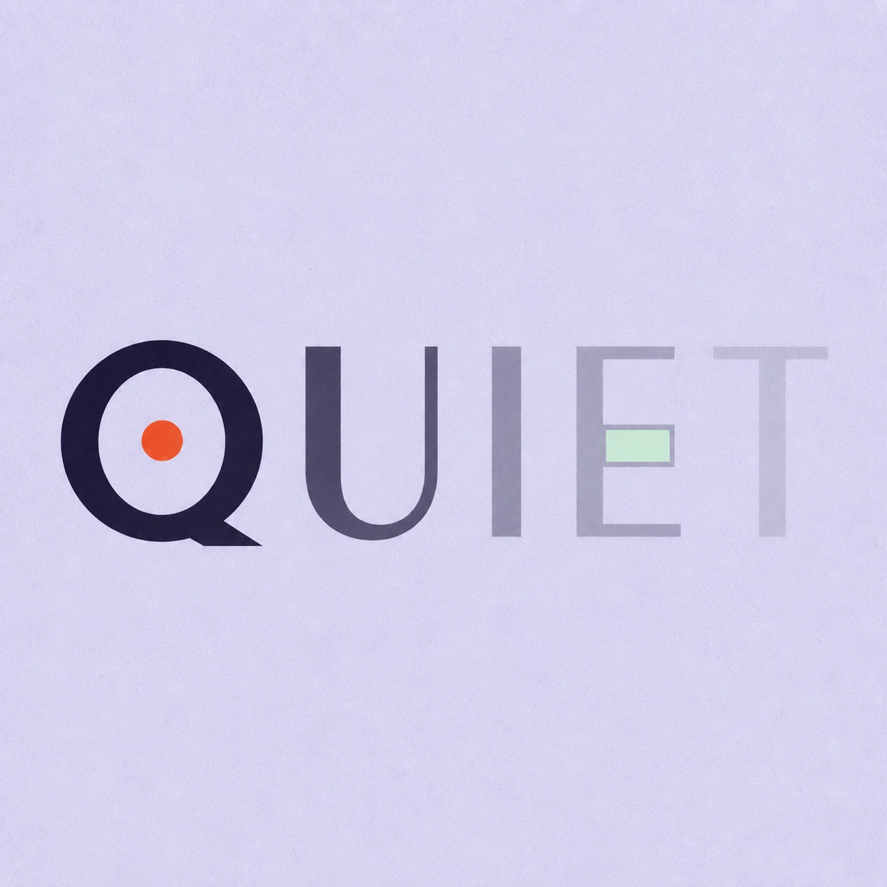
Silence is not empty. It is space kept deliberately.
Use this direction
A clear voice for a thoughtful brand.
Use this directionFrom your text to a considered image.
- 01
Enter the exact wording
Use a short name or title, preserving case, spaces and punctuation within the 40-character limit.
- 02
Open the raised-paper brief
Choose a palette and continue to Studio. Refine the apparent lift and lighting while keeping the paper one continuous surface.
- 03
Check the edge and small view
Read the thumbnail first, then inspect counters, accents and the direction of the relief shadows at full size.
Before you create.
How is this different from letterpress text?
This starter depicts letters raised from the paper with light around their edges. The letterpress starter uses inked letters and a shallow recessed impression. They are separate visual directions on a paper surface.
Does it create a physical embossing die or print mask?
No. Studio creates a square artwork image, not measured relief, vector separations or manufacturing files. Ask your printer for the stock and mask requirements before producing a physical piece.
Can I use a different paper color?
Yes. Choose another available palette before opening Studio and adjust the visual brief. The sample uses quiet ivory and gray; review whether the raised edge remains visible against your selected field.
Can I emboss Chinese characters or punctuation?
The brief accepts exact Unicode text within 40 characters. Inspect every radical, accent and punctuation mark after generation; a shallow relief edge must not erase a fine stroke or change the supplied sequence.