 Minglyph
Let the space inside a letter say something.
Explore a negative space logo concept built from your own name. Start with a readable wordmark, then give one opening inside a letter a distinct shape. This generator uses the Semantic glyph direction in Studio to make the empty space part of the idea.
Free public preview · No sign-up required · See plans and downloads
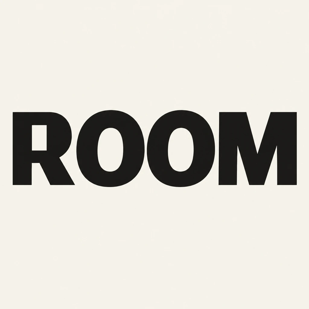
Find a space the name already has.
Letters such as A, B, D, O, P and R contain enclosed spaces called counters. Other letters offer openings between strokes. Choose a place that can carry the idea while leaving the original character recognizable. In ROOM, the rectangular counter inside R suggests an interior space; the bowl and diagonal leg still need to read as R. Your name may need a different letter or a smaller intervention.
Make one clear decision.
Write the intended meaning as a simple sentence, then describe one opening that could express it. Compare a generous counter with a narrower version using the same name and palette. If the idea requires several hidden pictures, a second reading direction or a missing stroke, simplify it. A useful result works twice: the name reads immediately, and the empty shape rewards a closer look.
Test what disappears at small sizes.
Reduce the concept to the size of a website header or a small label. Thin gaps can close, two separate letters can appear joined, and a subtle cutout can become an accidental blemish. Compare the word on light and dark grounds when preparing the final identity. Rebuild the selected mark in an appropriate design tool if you need controlled vector paths, transparent backgrounds or size-specific versions.
Another way to approach the letters.
Selected studies with their own briefs. Open a direction and replace the text with yours.
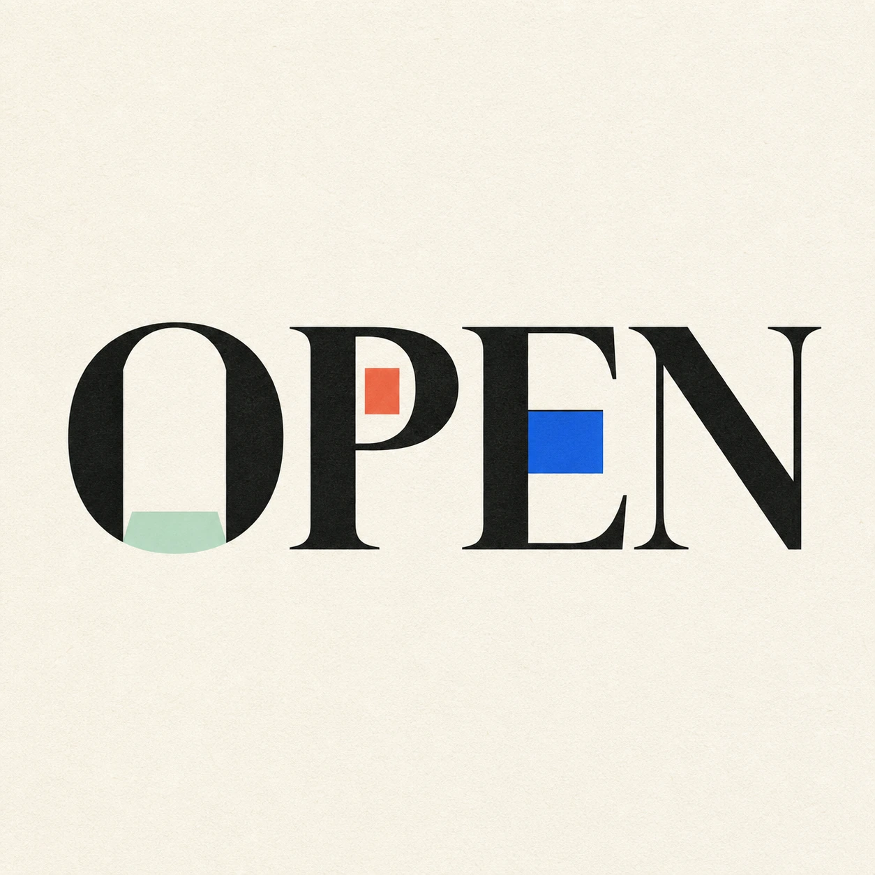
Possibility begins where a closed form gives way.
Use this direction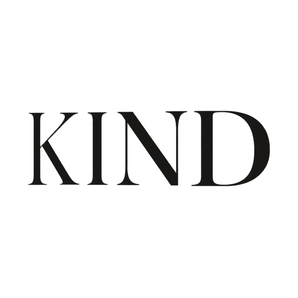
A clear voice for a thoughtful brand.
Use this directionFrom your text to a considered image.
- 01
Start with the exact name
Keep the intended case, spelling and punctuation. A short name gives each opening more room in the first study.
- 02
Describe one empty shape
Choose a palette and open the Semantic glyph brief. Tie the opening to a suitable letter instead of adding a separate icon.
- 03
Check both readings
Read the entire word first, then inspect the negative shape. Reject versions that lose a letter or rely on a detail too small to see.
Before you create.
How is this different from a general wordmark generator?
A general wordmark explores the overall lettering, weight and spacing. This starter focuses on the shape of one background-colored opening within a letter and the idea that opening can communicate.
Will every name work with the doorway shown in ROOM?
No. The sample uses the counter in R. Your name may have different counters, open strokes or character structures. Change the brief to fit the supplied text rather than forcing the same detail into every name.
Does negative space mean the image is transparent?
No. Negative space is a design relationship between the letter and its background. This starter renders a fixed artwork image on a background; it does not promise transparent pixels, editable paths or a finished vector logo.
Can it work with Chinese characters or a creator handle?
Yes, the Studio brief accepts exact Unicode text within 40 characters. Use a suitable opening without removing a radical or stroke. For handles, inspect every @, period and underscore as part of the identity.