 Minglyph
Give the next issue a familiar face.
Explore a short newsletter name as lettering artwork, then test it at the top of your email. Keep the title recognizable at a narrow screen width and leave the issue information as ordinary readable text.
Free public preview · No sign-up required · See plans and downloads
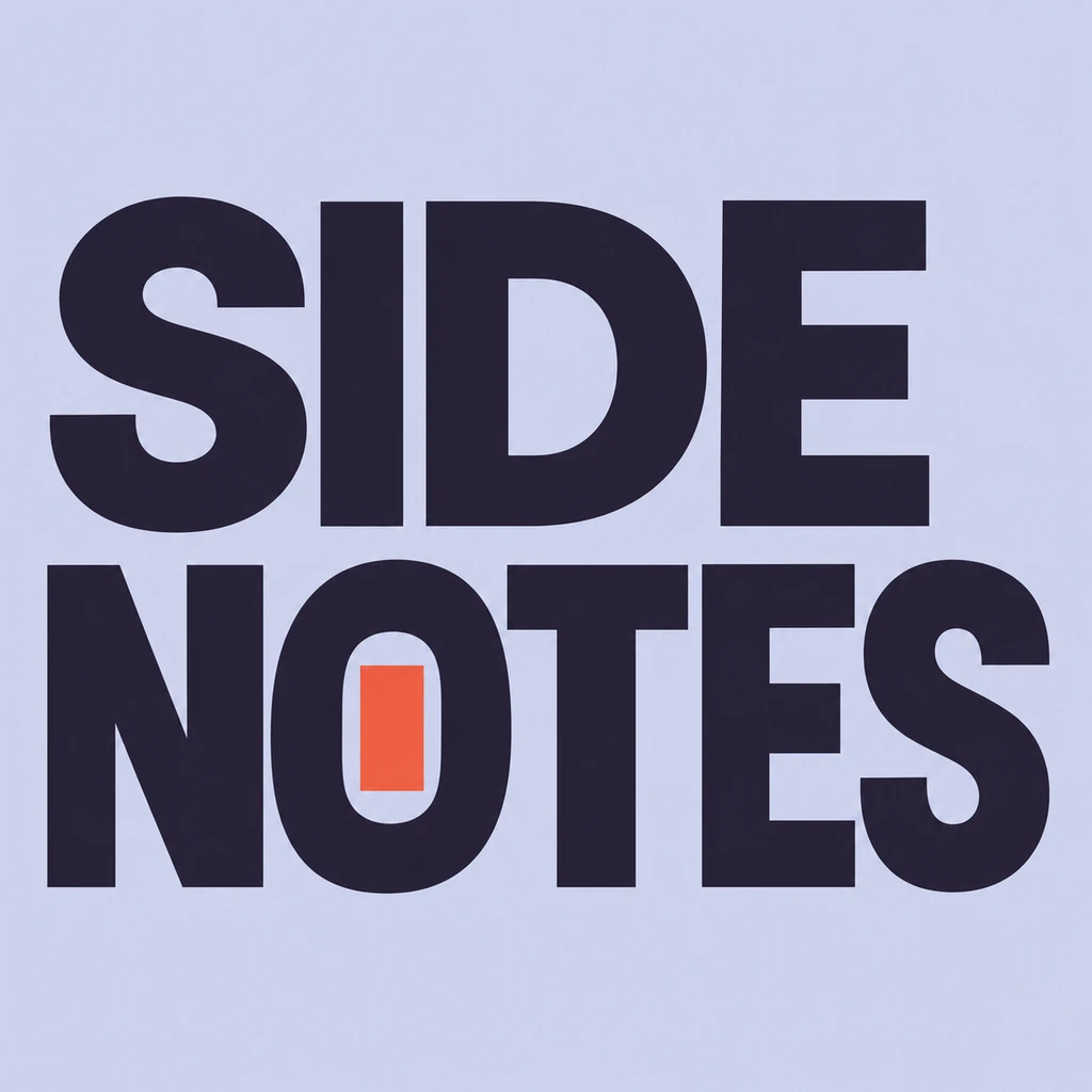
Choose the name that stays from issue to issue.
Separate the newsletter identity from the current subject, issue number and date. A stable name gives readers something familiar before they reach the new content. The SIDE NOTES example is a selected historical podcast-title study: its two word groups and open counters illustrate a compact reading order. It was not newly generated as an email banner. If the newsletter accompanies an audio series, compare how the same name reads in a square cover and in the inbox. Compare a title-led podcast cover.
Test the whole header at a narrow width.
Place the square lettering concept into a rough email header without stretching it into a wide rectangle. The surrounding header can be wider than the image. Compare title size, clear space and contrast together on a narrow preview before judging the decorative detail. If two stacked words use too much vertical room, describe a simpler reading line in Studio. A repeatable identity matters more than changing the entire treatment for every issue. Study a name as a repeatable wordmark.
Keep the email useful when the image is absent.
Include the newsletter name and issue context as live text in your email editor; give a meaningful title image an appropriate text alternative. Preview the actual email with images unavailable as well as visible. The important identity and links should still make sense. Minglyph supplies lettering artwork to explore a direction, not responsive email HTML, a mailing list integration or a tested inbox template. Check the final email in the clients used by your readers.
Another way to approach the letters.
Selected studies with their own briefs. Open a direction and replace the text with yours.

A reminder to leave the next question open.
Use this direction
A clear voice for a thoughtful brand.
Use this directionFrom your text to a considered image.
- 01
Enter the stable name
Keep exact case, accents and punctuation within 40 characters. Leave changing issue information outside the artwork.
- 02
Set one recognizable direction
Choose a palette, continue to Studio and refine the brief for your newsletter. The selected historical example retains its original podcast context until you edit it.
- 03
Preview inside the real email
Use the available PNG in your email editor. Check narrow-width reading, image proportions, plain text identity and the image-disabled version together.
Before you create.
Does this build or send a newsletter?
No. It creates square AI lettering artwork for a name. Build the header and responsive email in your email editor, then test and send through your own newsletter service.
Can I choose a wide email-banner size here?
The current generation path creates a square image. Place it without distortion in a wider header layout. This page does not offer arbitrary canvas dimensions or automatic responsive cropping.
Why does the example say SIDE NOTES?
It is an owned historical podcast-title study reused to show a clear two-line name. Its original example brief is preserved; edit the meaning and context for your newsletter. It is not a new email commission or proof of inbox performance.
Can the name include Chinese characters or a creator handle?
Yes. The brief carries exact Unicode within 40 characters, including supplied punctuation. Inspect every radical, accent, @ and period in the result and at the intended email display size.
Is an image header enough for accessibility?
Keep the essential name, issue information and links available as live text in the actual email. Add suitable alternative text to a meaningful title image and test the image-disabled reading order. An attractive PNG alone does not verify email accessibility.