 Minglyph
Let the edges carry the word.
Turn a short title or name into a graphic study of hollow letters. The outline defines the character while the interior takes the background color, leaving a lighter silhouette than a solid block of type.
Free public preview · No sign-up required · See plans and downloads
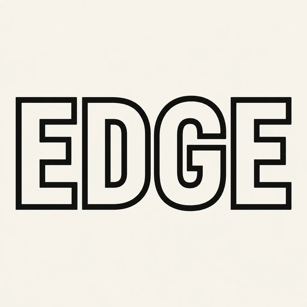
Give the border enough weight to read.
An outline has to carry the whole letter without the help of a solid fill. In EDGE, a dark border traces broad capitals against a quiet ivory field. Begin with a substantial outline and generous letter shapes. Then reduce the image to the size of its final preview. If the border disappears or looks broken, ask for a heavier edge. If adjacent edges merge into dark patches, open the spacing before adding more weight.
Check the spaces inside the spaces.
A hollow letter can contain two kinds of open area: the unfilled body of the stroke and a counter such as the enclosed space in D. Keep both distinct. Follow the border around the whole character and check openings such as the mouth of G or the gap between the arms of E. Very thick edges can close those openings. Very narrow outlines can make the internal structure look like a second, accidental character.
Choose a background that supports the edge.
Compare the outline against one calm color before placing the concept in a busier layout. A hollow letter lets the surrounding field dominate its appearance, so strong border contrast matters even when the word is large. This starter renders that relationship as a complete square image. For a website heading or a photo overlay that needs editable text, use the selected image as a visual reference and build the final text layer in your layout tool.
Another way to approach the letters.
Selected studies with their own briefs. Open a direction and replace the text with yours.
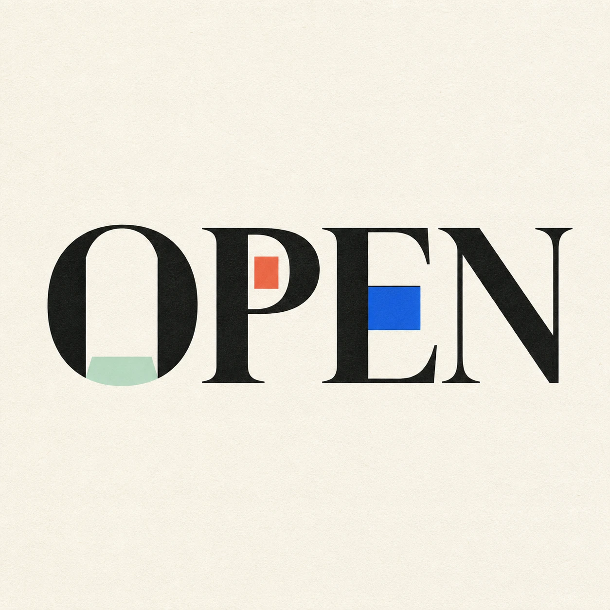
Possibility begins where a closed form gives way.
Use this direction
A clear voice for a thoughtful brand.
Use this directionFrom your text to a considered image.
- 01
Set the exact wording
Enter up to 40 characters, keeping the case, spaces and punctuation you want. A short word gives the inner and outer edges more room.
- 02
Explore one clean outline
Choose a palette and open the Graphic poster brief. Adjust the described border weight, letter width or spacing in Studio.
- 03
Read both the large and small views
Inspect complete borders and open counters at full size. Shrink the result to check that thin edges and punctuation remain clear.
Before you create.
Does this make copy-and-paste outline text?
It makes an artwork image of your supplied text. It does not replace letters with double-struck Unicode symbols or return styled characters for a caption. Keep an ordinary text caption alongside the image when sharing.
Are the hollow letters or background transparent?
This starter uses background-colored interiors on an opaque field. Hollow describes the visual letter treatment, not an alpha channel. It does not promise a transparent overlay or editable cutout.
Can I set the outline width in pixels or export SVG letter paths?
The Studio uses a written visual brief rather than a numerical stroke-width control. Its generated lettering is an image, not editable vector outlines. Use a design editor when you need measured borders or precise paths.
Can I outline Chinese characters, accents or punctuation?
The brief accepts exact Unicode text within 40 characters. Inspect small strokes, accents and punctuation carefully: an outline must preserve their structure. Dense characters may need wider spacing or a simpler treatment to stay readable.