 Minglyph
A word assembled from small differences.
Explore a short title as printed letters on separate paper clippings. Vary a few type shapes and tile angles while keeping one readable sequence, so the collage feels deliberate rather than accidental.
Free public preview · No sign-up required · See plans and downloads
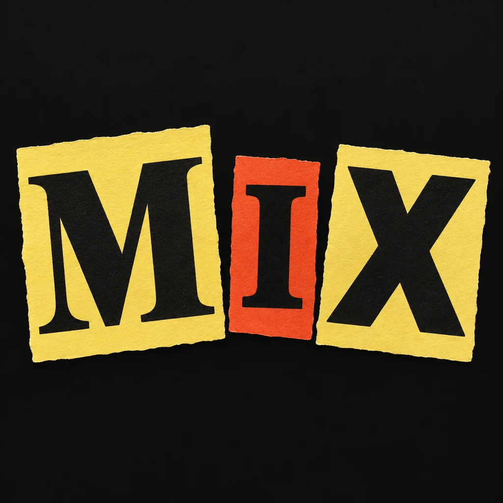
Keep the order stronger than the variation.
MIX uses three complete black letters on separate paper tiles. The serif M, barred I and heavier X have different shapes, but their contrast and left-to-right spacing make one word. Begin with the exact wording, then vary only a few qualities: weight, proportions or a small tilt. The I needs a clear letter structure so it cannot be mistaken for a numeral or an isolated strip of paper.
Decide what is being cut.
Here a printed letter sits on a piece of paper; the paper edge is separate from the letter shape. Keep that edge far enough away from accents and punctuation to preserve them. A small irregular tile can explain the handmade idea without torn fragments across the whole image. If you want the letter itself cut from layered material, compare the paper-cut direction before choosing a construction. Compare letters cut from layered paper.
Use the collage as a title element.
This direction can provide an image for a personal zine cover, a music title or an editorial concept. Keep supporting text as editable type in your layout editor, where its hierarchy and spacing can be adjusted. Minglyph creates an original AI image; it does not select letters from a real publication, supply licensed magazine scans or create an editable bank of letter tiles. The generated wording still needs a final spelling review.
Another way to approach the letters.
Selected studies with their own briefs. Open a direction and replace the text with yours.
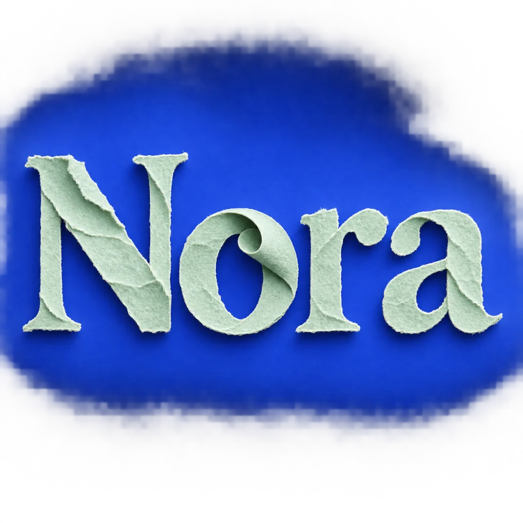
A name that unfolds at its own pace.
Use this direction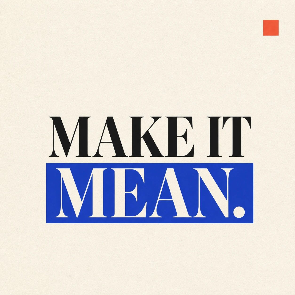
A strong visual rule makes a short statement land.
Use this directionFrom your text to a considered image.
- 01
Enter the exact title
Use a short word or phrase within 40 characters. Preserve its case, accents, spaces and punctuation before introducing visual variation.
- 02
Set the printed-paper direction
Choose a palette and open the Graphic poster brief. Describe complete printed letters on individual paper tiles, limited rotation and a clear reading line.
- 03
Read first, inspect the cuts second
Check the thumbnail for the exact sequence. At full size, check every small mark, letter opening and tile edge; reduce variation wherever it disrupts the word.
Before you create.
Is this an editable ransom-note font or a set of cutout letters?
No. It creates a square AI lettering image. The text is editable in the Studio brief before generation, but the result is not a font file or separate reusable letter assets.
Can I choose a specific font or magazine clipping for each character?
This starter uses an original written collage direction rather than a source-publication library or a per-letter font selector. Describe a broad contrast in letter shapes and inspect the result; individual forms are not numerically locked.
Can it make a full page of multiline text?
This starter is intended for short lettering within the 40-character input limit, not a complete typeset document. Create the title image, then arrange longer supporting text in a layout editor.
Can I preserve Chinese characters or mixed-language wording?
The brief carries exact Unicode text. Check small radicals, accents and punctuation after generation. Keep tile cuts, overlaps and variations quiet around dense character structures.