 Minglyph
Give a word the character of wood.
Make a short name or title feel hand-carved. This wood text generator starts with pale wooden letters, visible grain and a dark ground. Add your exact text and choose a palette, then refine the material and lettering in Studio.
Free public preview · No sign-up required · See plans and downloads
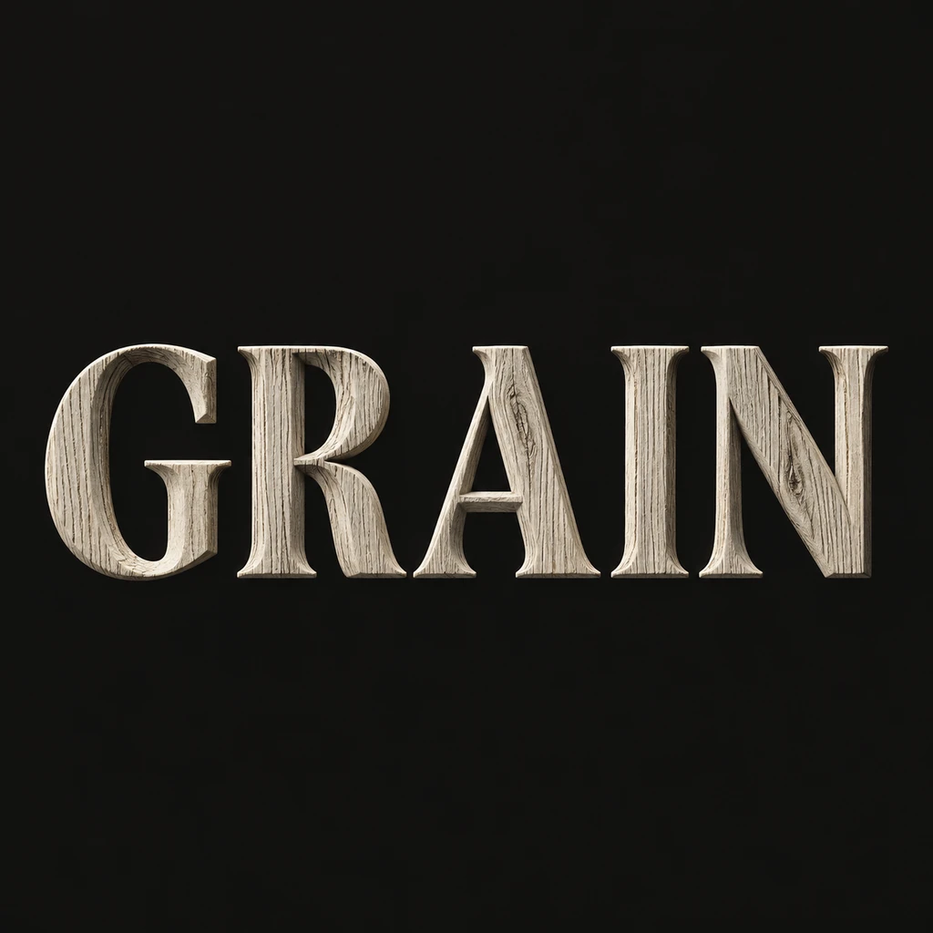
Build a readable silhouette first.
Use a short word to judge spacing and thickness before adding knots or splits. GRAIN leaves room to read each letter face as material: the narrow I belongs to the group, while the counters of R and A stay open. For a longer name, try shallower relief and finer grain so the texture does not swallow the smaller letter shapes.
Let the surface explain the material.
The starter uses separate carved letters with grain contained inside each face. Beveled edges and shallow shadows make the thickness visible. Keep the grain direction and edge treatment consistent across the word, then choose one detail to emphasize. A colored palette can suggest painted wood; retain enough surface detail for the wood effect to read without adding branches, leaves or an unrelated scene.
Check the image at its intended size.
A header image, a name card and a square social post give fine wood grain different amounts of room. Reduce the artwork to a thumbnail and check whether the word still reads before judging the texture close up. For a physical sign, share the chosen image as a visual brief. A fabricator still needs dimensions, material choices and suitable production files; this image does not supply cutting paths or carving depths.
Another way to approach the letters.
Selected studies with their own briefs. Open a direction and replace the text with yours.
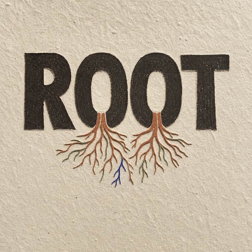
What holds us up is often the part no one sees.
Use this direction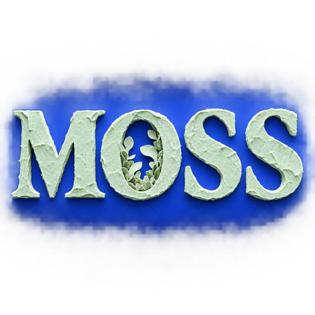
An independent brand with room to grow.
Use this directionFrom your text to a considered image.
- 01
Enter the exact lettering
Use the spelling, capitalization and punctuation you want to see. A short word makes the first material comparison easier.
- 02
Set the wood direction
Continue with the Organic style. In Studio, refine the grain, edge treatment or painted finish while keeping one clear material idea.
- 03
Review the complete word
Inspect every letter, then compare the full image and a small preview. Keep the version with the clearest silhouette and surface detail.
Before you create.
Does this create a wood font I can type with?
It creates a square image of your supplied text with a wooden material effect. It does not create an installable font or a set of copy-and-paste wood characters.
Can I use a brand name or Chinese characters?
Yes. Enter your exact name, brand term or mixed Unicode text within the 40-character input limit. Review all letters, punctuation and character structures after generation.
Can I send the image directly to a laser cutter or CNC machine?
The generated artwork is a visual concept. It does not contain toolpaths, material thickness, cutting settings or a verified engraving layout. Prepare and check the final production file for the chosen process separately.
Can I change the color of the wooden letters?
Yes. Choose one of the four palettes before opening Studio. You can also describe a painted finish in the brief; keep the grain and letter edges readable against the background.