 Minglyph
Let thread draw the letters into cloth.
Make a visual study of a name, short phrase or textile identity idea. The lettering appears as thread anchored in one fabric field, with its spelling and shape more important than decorative stitch detail.
Free public preview · No sign-up required · See plans and downloads
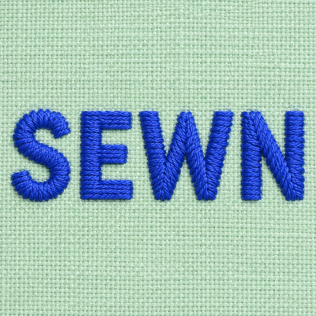
Build the letter before the stitch texture.
The SEWN study uses closely packed thread marks inside four complete capitals. Look for the three bars of E, the joining strokes of W and clear space between neighboring letters. Begin with broad, uncomplicated shapes; tightly packed thread detail should make the surface believable without closing a counter or turning a narrow stroke into a loose strand.
Keep the cloth and thread distinct.
Choose a calm fabric field and a contrasting thread color so the word reads before its texture. A few raised fibers and small shadows can suggest stitched depth, but the cloth stays one continuous background. That is different from felt letters cut out as separate soft pieces. Check a phone-sized version: if only the fabric weave remains visible, simplify the thread treatment or widen the letters.
Separate the image from production files.
This artwork is a visual reference for a textile concept. An embroidery machine needs a digitized stitch file with paths, density, underlay and fabric-specific adjustments; the image does not contain those instructions. Share the selected concept and the exact wording with an embroidery specialist, then follow that producer’s size and material rules before making a physical item.
Another way to approach the letters.
Selected studies with their own briefs. Open a direction and replace the text with yours.

Quiet can have weight without asking for attention.
Use this direction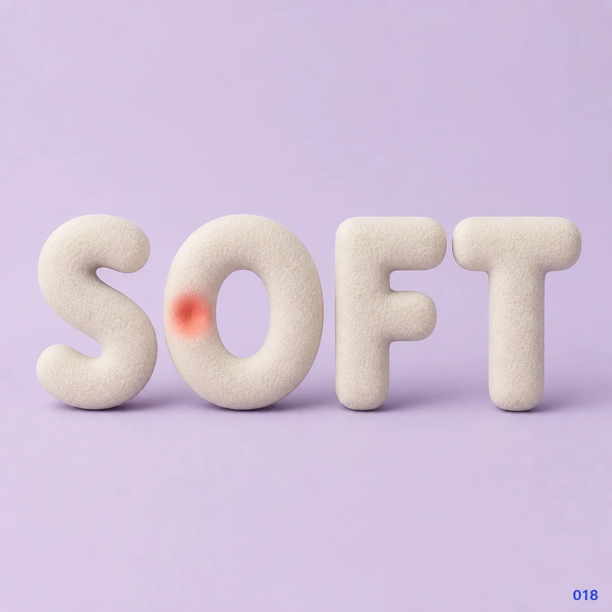
Gentleness can leave a visible impression.
Use this directionFrom your text to a considered image.
- 01
Enter the wording to show
Use a short name or phrase within 40 characters. Preserve case, accents, spaces and punctuation exactly as you want them reviewed.
- 02
Open the stitched-text brief
Select a palette and continue to Studio. Adjust fabric contrast and apparent stitch density in the written direction.
- 03
Inspect shape and texture
Read the thumbnail, then check every stroke and mark at full size. Prepare machine embroidery separately with the intended producer.
Before you create.
Does this export a DST, PES or other stitch file?
No. The result is a square artwork image, not stitch paths or machine instructions. Physical embroidery requires separate digitization for the fabric, size and machine workflow.
Is this the same as felt text?
No. This starter depicts thread stitches lying on a continuous fabric field. The felt page depicts separate wool-felt letter bodies with fibrous edges and contact shadows.
Can I set stitch count or stitch direction precisely?
Studio offers a written visual brief, not a stitch-count editor or production simulator. Describe the appearance you want, review the resulting image, and set machine parameters with embroidery software or a specialist.
Will it preserve a Chinese name or mixed-language phrase?
The brief carries exact Unicode text within 40 characters. Check each radical, accent, space and punctuation mark in the image. Fine strokes may need a simpler visual treatment, and a real embroidery plan needs its own legibility review.