 Minglyph
Give the word some wear.
A weathered title can feel handled, loud or deliberately imperfect. Start with a complete word, then introduce small worn areas that change its surface without losing its spelling. The result is a lettering image for a cover, social graphic or visual study.
Free public preview · No sign-up required · See plans and downloads
Preserve the structure under the distress.
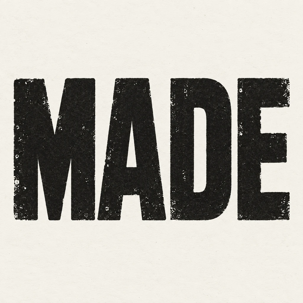
Grunge lettering depends on the difference between a solid character and an uneven surface. Keep stems, crossbars and counters clear before asking for abrasion. The reused MADE study puts small ink skips inside broad black letter faces on off-white paper instead of cutting away the skeleton. It demonstrates restrained wear rather than a heavily destroyed surface. Read the word at phone size first. A gap that turns E into F or removes a punctuation mark is an error, even if its texture looks convincing.
Choose how the wear happened.
Uneven ink, rubbed paint and a scratched solid surface suggest different histories. Choose one for the first brief instead of combining them. Keep the background calm so the small damaged areas have a place to read. For an impression that mainly suggests uneven contact with paper, use a stamped-ink direction rather than general surface abrasion. Compare a stamped-ink impression.
Separate texture from the lettering gesture.
A worn face can sit on upright, quiet letters. It does not need loose strokes, a slanted tag or scattered paint. If the project needs movement in the shape itself, compare a brush-led direction while retaining the same wording. Place the PNG into a rough version of your intended layout before choosing the letter proportions. Judge readability and the space around the word together at the final display size. Prepare dates, credits and long copy separately; this workflow supplies the short title image rather than a complete editable poster. Compare a brush-led letter shape.
Another way to approach the letters.
Selected studies with their own briefs. Open a direction and replace the text with yours.
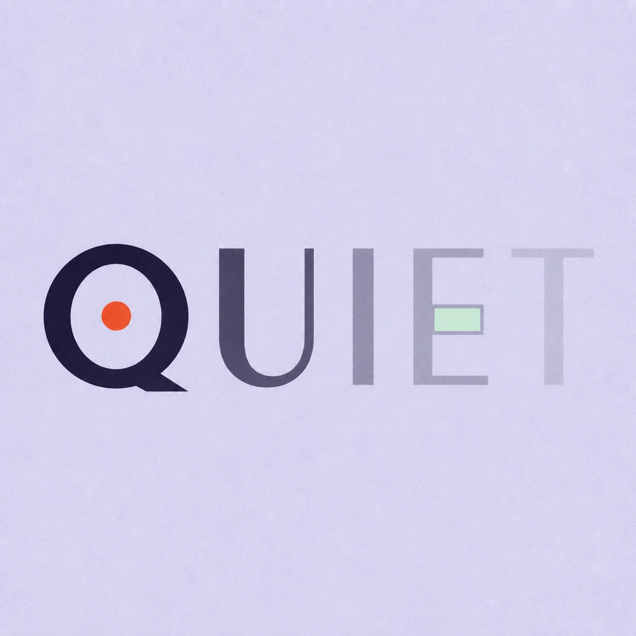
Silence is not empty. It is space kept deliberately.
Use this direction
A clear direction for an ambitious idea.
Use this directionFrom your text to a considered image.
- 01
Set the exact title
Enter your own wording within 40 characters. Check its case, spaces, accents and punctuation before adding any worn effect.
- 02
Describe one kind of wear
Choose a palette and open the Graphic poster brief. Specify contained patches and complete letters; compare the same word with a cleaner surface.
- 03
Read at the intended size
Check the small preview before inspecting grain at full size. Keep each required stroke and mark recognizable, then download the usable image.
Before you create.
Does this create a grunge font or editable distress layer?
No. Minglyph creates a square AI lettering image. It does not export an installable font, separate texture mask, vector outlines or per-letter editing layers.
Can I control the amount of distress precisely?
Describe lighter or stronger wear in the written Studio brief and compare results. There is no numerical abrasion slider or fixed placement control, so inspect every letter after generation.
Is grunge the same as graffiti lettering?
Grunge describes a worn or rough surface. Graffiti can change the structure, angle and painted character of letters. This starter keeps the underlying blocks complete and uses contained surface wear.
How should I judge proportions and readability?
Place the lettering PNG into a rough layout first, with the planned margins and supporting text. Inspect it at the final use size. Adjust the written brief and composition together rather than choosing proportion or readability in isolation.
Can I use Chinese, accents or punctuation?
The brief carries exact Unicode text within 40 characters. Check dense radicals and small marks carefully; reduce distress wherever it hides an essential detail.