 Minglyph
Let one shadow give the word direction.
Explore a short title with a solid, extended shadow behind each complete character. The flat projection adds motion to the composition while the word stays readable at first glance.
Free public preview · No sign-up required · See plans and downloads
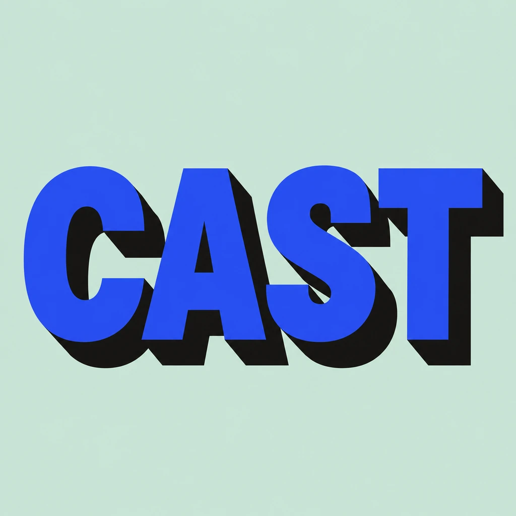
Keep every shadow moving together.
The CAST study uses one down-right direction for all four letters. Start with broad, complete fronts and make the shadow a secondary shape behind them. If one letter projects at another angle, the word reads as several effects rather than one typographic system. Keep the shadow hard-edged and flat; a soft blur suggests an ordinary drop shadow, while a bevel changes the idea into sculpted 3D lettering.
Protect counters and the space between letters.
A long shadow needs room to extend, especially below a wide title. Check the opening of A, the curve of C and the gap between neighboring characters after the shadow is added. If black areas join into a single bar, shorten or lighten the projection in your written brief. Leave a margin around both the fronts and their shadows so a square crop does not remove the intended direction.
Choose the right output for the job.
This image can be a headline study for a cover, label or social graphic. The shadow is part of the rendered artwork, so it is useful for comparing visual directions. It is not an editable layer, CSS text-shadow rule, font, SVG cut file or measured extrusion. If a fabricator needs exact offsets or vector paths, rebuild the selected idea in a design tool to that specification.
Another way to approach the letters.
Selected studies with their own briefs. Open a direction and replace the text with yours.
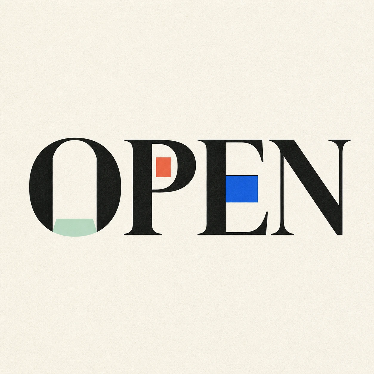
Possibility begins where a closed form gives way.
Use this direction
A reminder to leave the next question open.
Use this directionFrom your text to a considered image.
- 01
Write a concise title
Enter the exact characters and punctuation. Short words leave more room for the projection and letter spacing.
- 02
Set one shadow direction
Choose a palette and open the Graphic poster brief in Studio. Describe a single angle and a shadow clearly behind the word.
- 03
Check the front and projection
Read the fronts at thumbnail size, then inspect counters, shadow continuity and the square margin at full size.
Before you create.
How is this different from retro text?
The retro starter uses rounded seventies-inspired letters and a compact offset. This page focuses on a longer, flat projection behind complete letter fronts, without requiring a period style.
Can I set the shadow angle or length numerically?
Studio offers an editable visual brief, not angle and distance sliders. Describe the direction and relative length, then review the generated image. Use a vector editor for exact measurements.
Does this export a layered SVG or cutting file?
No. The result is a square artwork image. Editable shadow layers, SVG paths and cut-ready separations must be prepared separately for a production workflow.
Can I enter Chinese characters or mixed-language text?
Yes. The brief accepts exact Unicode text within 40 characters. Inspect every radical, accent, space and punctuation mark; a dark projection must not merge neighboring strokes.