 Minglyph
Give a word the weight of stone.
Explore a short title or name as separate polished marble letters. Keep the silhouettes readable, then let a little mineral veining and shallow edge thickness explain the material.
Free public preview · No sign-up required · See plans and downloads
Keep the stone inside the letter.
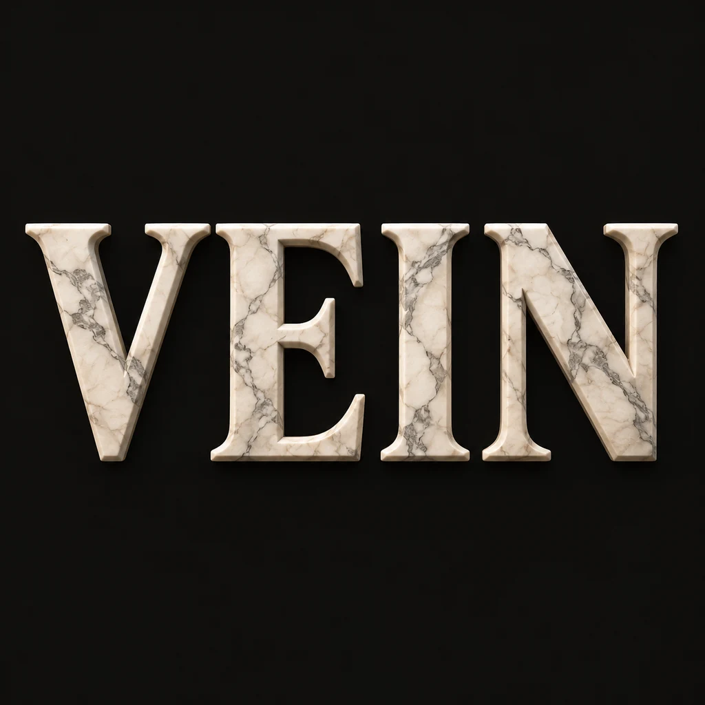
VEIN uses broad off-white letters on a quiet dark field. The V diagonals and three E bars remain complete before the surface detail becomes visible. Begin with generous stems and enough space around each character. Veining should belong to the face of a letter, rather than becoming a stripe that joins the whole word or a crack that removes a necessary stroke.
Choose a quiet vein pattern.
A few fine mineral marks can make the surface feel dense and polished. Too many dark bands may make an I look split or a counter look filled. Compare a small preview with the full image, then simplify the pattern if the texture wins the first glance. For a warmer carved material with a clearer directional grain, compare the wooden lettering study. Compare carved wooden lettering.
Use the weight in a wider composition.
A stone-text image can provide a calm title direction for a cover, a personal name card or an architecture-themed concept. Keep supporting copy as editable text in the final layout. The artwork suggests marble; it does not identify a real stone slab, measure carving depth or provide a manufacturing file. A physical sign needs its own material selection, dimensions and fabrication review.
Another way to approach the letters.
Selected studies with their own briefs. Open a direction and replace the text with yours.

A clear direction for an ambitious idea.
Use this direction
Silence is not empty. It is space kept deliberately.
Use this directionFrom your text to a considered image.
- 01
Set the exact wording
Enter a short word or phrase within 40 characters, keeping the case, accents and punctuation that should remain visible.
- 02
Describe one stone surface
Choose a palette and continue to the Organic brief. Ask for complete marble letters, shallow edges and fine veins contained inside each face.
- 03
Read the shape before the grain
Inspect the thumbnail, then every stroke and mineral mark at full size. Reduce the vein density wherever it obscures the exact text.
Before you create.
Does this make a marble font or a real carved sign?
No. It creates a square AI lettering image. It does not export an installable font, stone dimensions, carving toolpaths or a physical object.
Can I choose a particular quarry or match a photographed slab?
This starter uses a written marble-surface brief. It does not identify stone provenance or promise a verified match to a specific slab. Describe the visual direction and inspect the result.
How is this different from stained-glass lettering?
Marble is shown as an opaque solid letter body with mineral veins. The stained-glass study uses internal pane boundaries and a translucent-looking surface. Both remain artwork images rather than fabrication plans.
Can I use Chinese characters or a mixed-language name?
Yes, within the 40-character exact-Unicode input limit. Check every radical, accent and mark after generation; keep veins especially quiet around fine strokes.