 Minglyph
Build a word from small squares.
Explore a retro title concept where square steps shape the letters themselves. Start with a short exact word and one clear cell rhythm, keeping the reading order stronger than the nostalgic detail.
Free public preview · No sign-up required · See plans and downloads
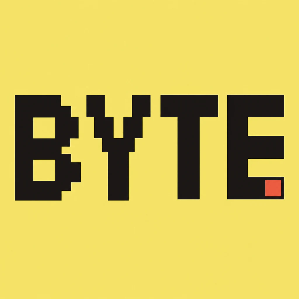
Use one cell rhythm across the word.
BYTE uses stepped bowls and diagonal arms to suggest a coarse pixel grid. The B keeps two openings, the T retains its top bar, and the E has three distinct arms. Describe one approximate cell size so neighboring letters belong to the same system. This is an AI visual brief: a convincing grid-like image is not evidence that every boundary lands on a mathematically exact bitmap grid.
Separate square-built shapes from dot texture.
Here the square steps define the silhouette, rather than decorating a smooth letter with small dots. Look at the word from a distance before zooming into the cells. Keep a clear gap between letters, use flat contrasting fields and remove loose pixels that could look like punctuation. If your project needs printed dot shading on an otherwise continuous letter, compare the halftone direction instead. Compare a printed halftone texture.
Plan the final title as an image asset.
Use the concept for an independent game-title study, a retro event tile or a personal channel graphic. Add menu labels and supporting copy separately as selectable text. Minglyph produces a square lettering image, not an installable pixel font, a sprite sheet or a working game interface. If a production game needs exact cell dimensions, rebuild the chosen direction in a pixel editor and inspect the final asset at its real display scale.
Another way to approach the letters.
Selected studies with their own briefs. Open a direction and replace the text with yours.
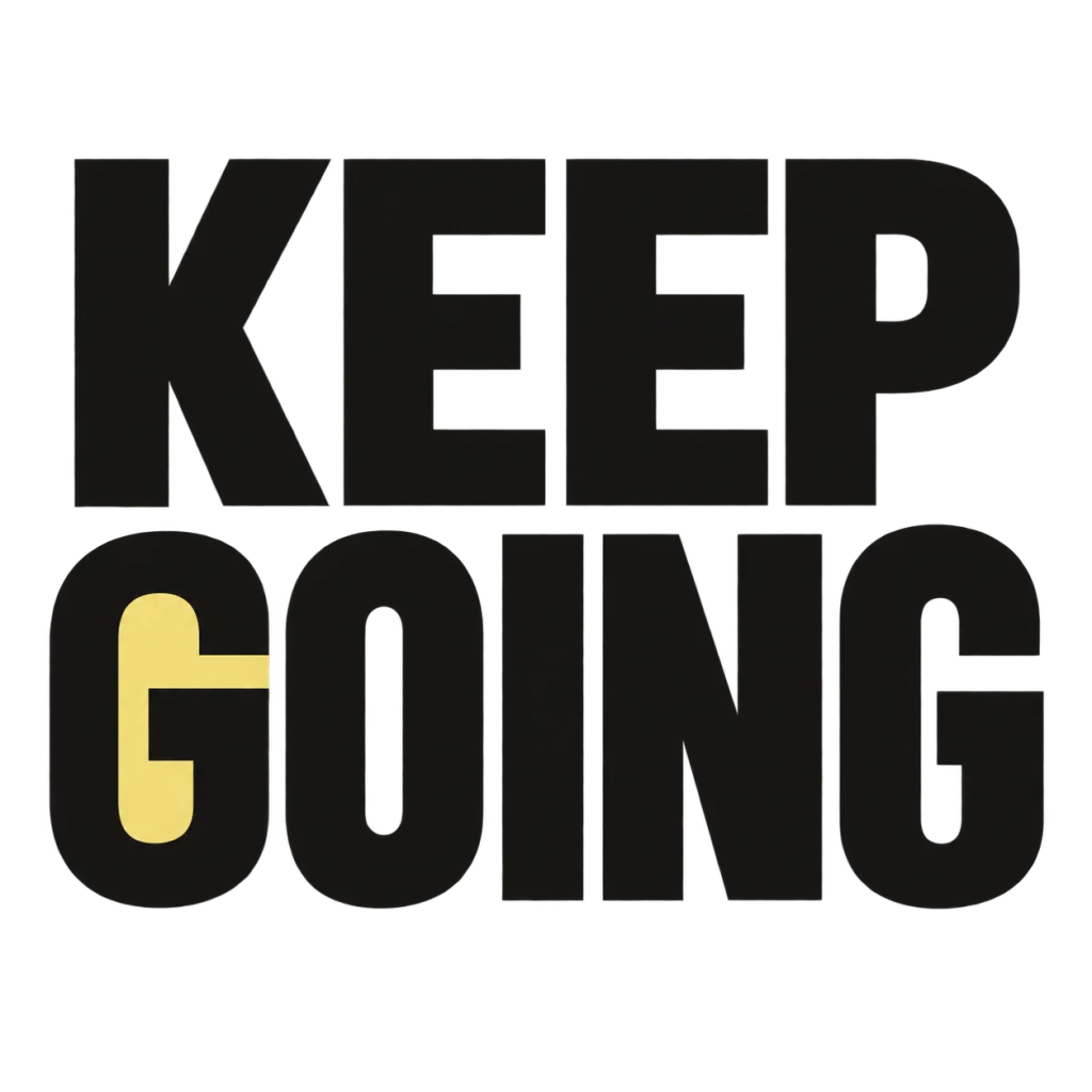
A small nudge for the work that matters.
Use this direction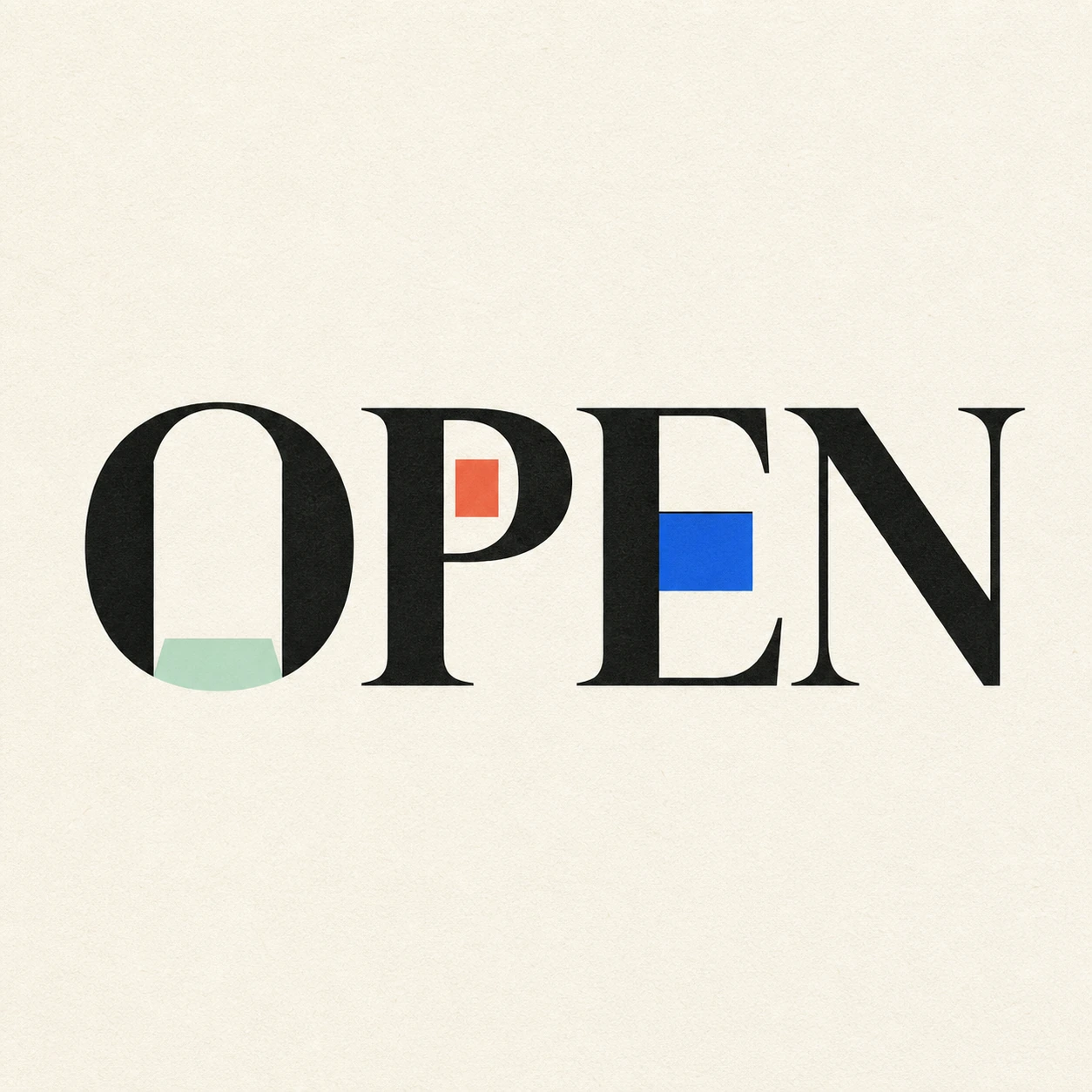
Possibility begins where a closed form gives way.
Use this directionFrom your text to a considered image.
- 01
Write a short exact title
Enter the word, name or phrase with its intended case and marks, within 40 characters. Shorter text leaves room for clear stepped forms.
- 02
Describe the square-cell system
Choose a palette, then open the Graphic poster brief. Ask for intact letters, a consistent coarse cell rhythm and clear gaps without game characters or screen decoration.
- 03
Read at the intended scale
Check the small image, then count required strokes and counters in the full view. Rebuild in a pixel editor when strict grid dimensions are part of the final specification.
Before you create.
Does this output a pixel font or copy-and-paste styled text?
No. It creates an image of your supplied words. It does not export an installable font, Unicode replacements or an editable alphabet.
Can I lock an 8-pixel grid or choose a fixed bitmap resolution?
The current Studio uses a written visual brief rather than cell-size or bitmap-grid controls. Describe the intended scale, then verify the result; use a pixel editor for strict dimensions.
Is this the same as a glitch or halftone effect?
No. This starter builds the visible letter edges from square steps. Glitch introduces displaced sections; halftone introduces printed dot shading. Choose the system that matches the job before adding other effects.
Can I use mixed Unicode text and punctuation?
Yes, within 40 characters. Exact text is carried into the brief. Inspect every radical, accent, symbol and counter after generation because coarse square forms can simplify small details.