 Minglyph
Let light live inside the letters.
Make a short title or name feel assembled from colored glass. Begin with readable whole letters, then divide their interiors into a few translucent panes so the material enriches the word rather than replacing it.
Free public preview · No sign-up required · See plans and downloads
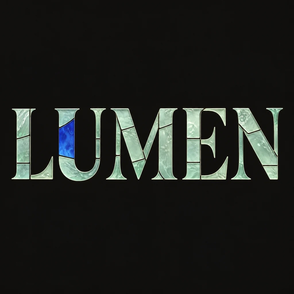
Build the silhouette before the panes.
The LUMEN study keeps five broad, complete letters in one reading line. The glass pattern sits inside their strokes, so you can read the word before examining individual pieces. Start with generous stems and counter openings. A narrow serif or dense character can become difficult to read when every small part is split again. Reduce the number of panes before making the letter itself more complicated.
Keep the leading inside each character.
Dark boundaries help separate neighboring panes, but they should not form a second drawing across the word. Check the U opening and the spaces around M: an internal division must stay distinct from a required stroke. This treatment fills the letter body with glass. If your idea depends on an empty center instead, compare a hollow outline before deciding which approach belongs in the layout. Compare hollow outline lettering.
Describe a light effect, not a real window.
A restrained highlight and a few differences between panes can suggest transmitted light in a still image. A calm background keeps those small changes visible. Use the result as a cover or poster direction, and add dates or other supporting text in your layout editor. The artwork is not a glass-cutting pattern, a physical window, a transparent overlay or a verified construction plan.
Another way to approach the letters.
Selected studies with their own briefs. Open a direction and replace the text with yours.

A clear voice for a thoughtful brand.
Use this direction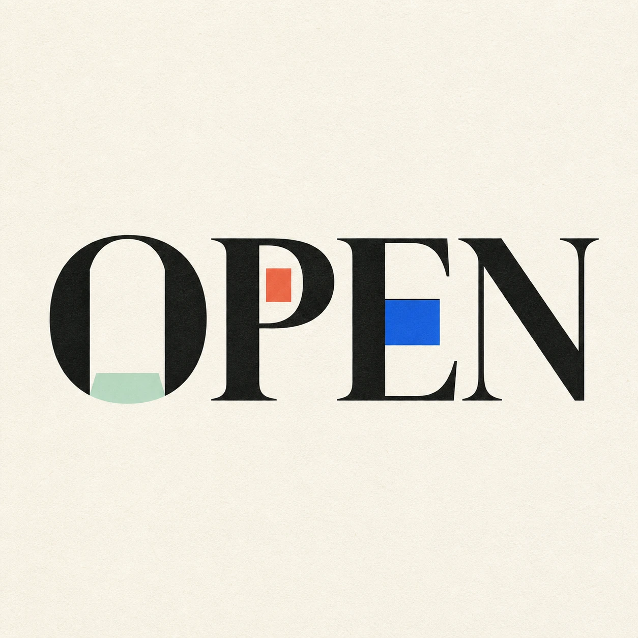
Possibility begins where a closed form gives way.
Use this directionFrom your text to a considered image.
- 01
Enter the exact lettering
Choose a short title or name within 40 characters. Preserve the accents, case, spaces and marks that should appear.
- 02
Set the glass direction
Choose a palette and continue to the Editorial brief. Describe broad panes, complete letter outlines and internal leading without a frame or surrounding scene.
- 03
Inspect large and small views
Read the thumbnail first. Then check every letter, counter and pane boundary at full size, especially fine strokes and punctuation.
Before you create.
Does this generate an actual stained-glass cutting pattern?
No. It creates an AI lettering image that suggests colored glass. It does not provide measured pane geometry, material specifications, joinery or fabrication-ready vectors.
Can I choose the exact pane shapes or leading thickness?
You can describe simpler divisions or thinner boundaries in the Studio brief. The current controls do not lock numerical geometry or a pane map; inspect each generated result.
Is the glass or background transparent?
This starter renders glass-like shading on an opaque square field. A translucent-looking material does not establish an alpha channel. Check the actual download and any later background editing separately.
Can I use Chinese characters or a mixed-language title?
The brief carries your exact Unicode text within 40 characters. Small radicals, accents and punctuation need particular care: keep fewer pane divisions where the character structure is dense.