 Minglyph
Make the short title readable in a video preview.
Start with the few words that make the video's subject clear. Explore those words as a separate PNG concept, then place the result beside your own snapshot in a layout editor. Judge the whole preview as a small image before choosing a direction. Minglyph provides title artwork; the final thumbnail, its crop and upload requirements belong to your publishing workflow.
Free public preview · No sign-up required · See plans and downloads
Choose wording that the video can deliver.
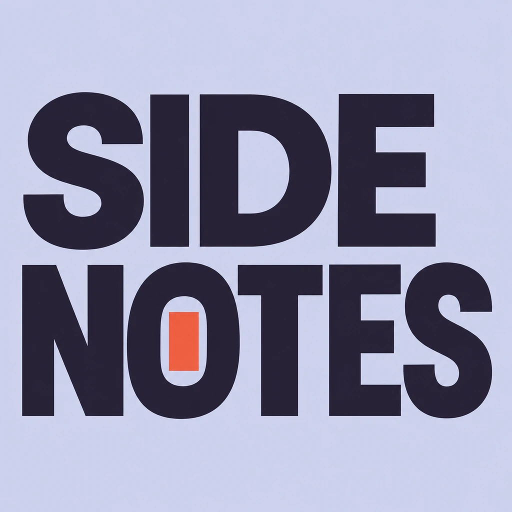
A title-image hook should support the actual episode, rather than promise a scene or result that is absent. Keep one clear reading line or a deliberate two-line order. Put episode numbering and channel details in editable text in your layout tool when they need consistency across uploads. Try the same short title under two restrained directions before changing the words. SIDE NOTES is an earlier owned podcast-title study reused as a lettering reference; it does not depict a real video or promise an episode outcome. Compare a message-led poster direction.
Give the letters one calm area.
A face, a work surface or a product can compete with lettering in a small preview. Place the square concept proportionally in the wide composition and check whether its surrounding field belongs there. Do not stretch letters to fill a rectangle. If a separate text layer is required over a snapshot, use the generated concept as a reference and rebuild that layer in the editor; this workflow does not promise transparency or editable fonts. Keep a show identity separate from the episode.
Review the final preview, then keep a record.
Inspect the complete thumbnail at a small feed-like size and the lettering at full size. Check spelling, punctuation, contrast and whether the title still describes the video. Keep the selected image and brief with the episode record so a later thumbnail can reuse a useful principle. Consult the current platform guidance for the final canvas, file size and upload eligibility; do not treat a square image download as an upload-ready thumbnail. Adapt an opening title from a recorded talk.
Another way to approach the letters.
Selected studies with their own briefs. Open a direction and replace the text with yours.
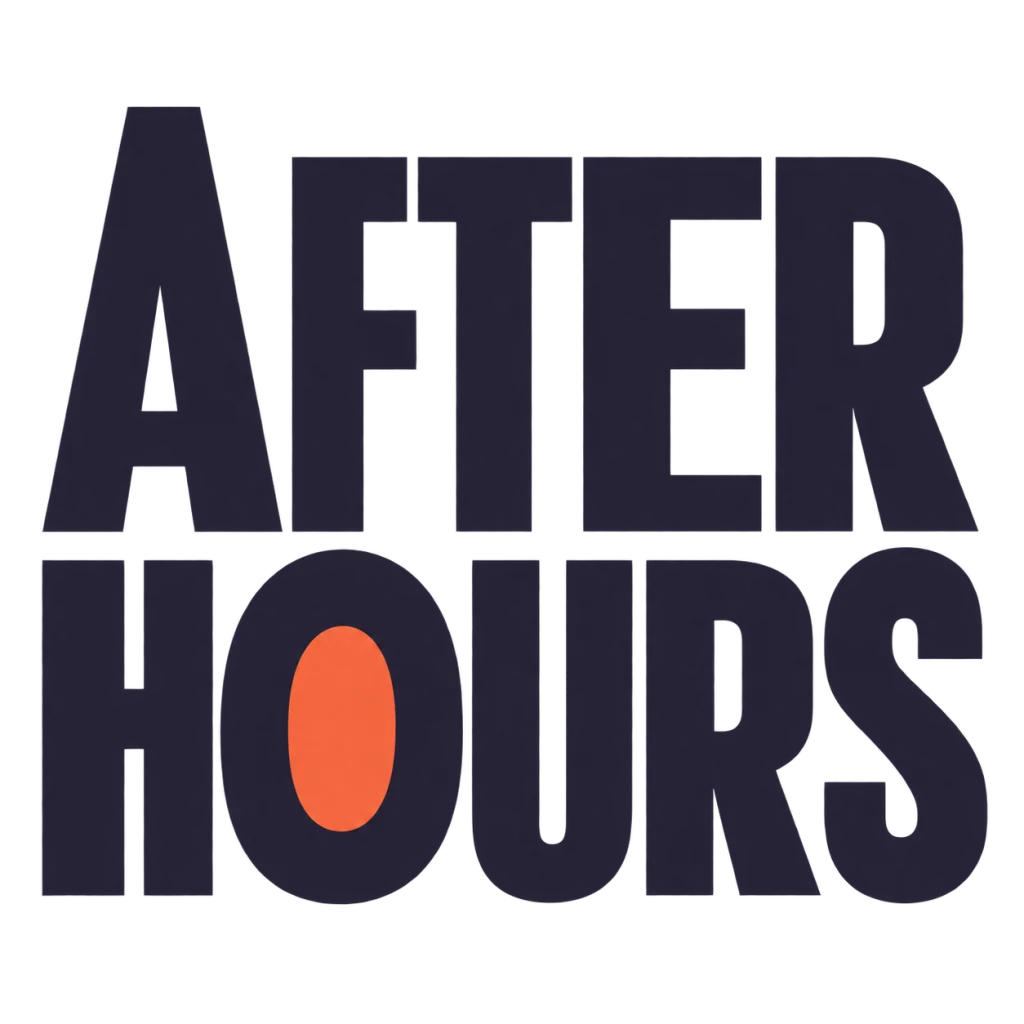
A cover for the hours that feel like your own.
Use this direction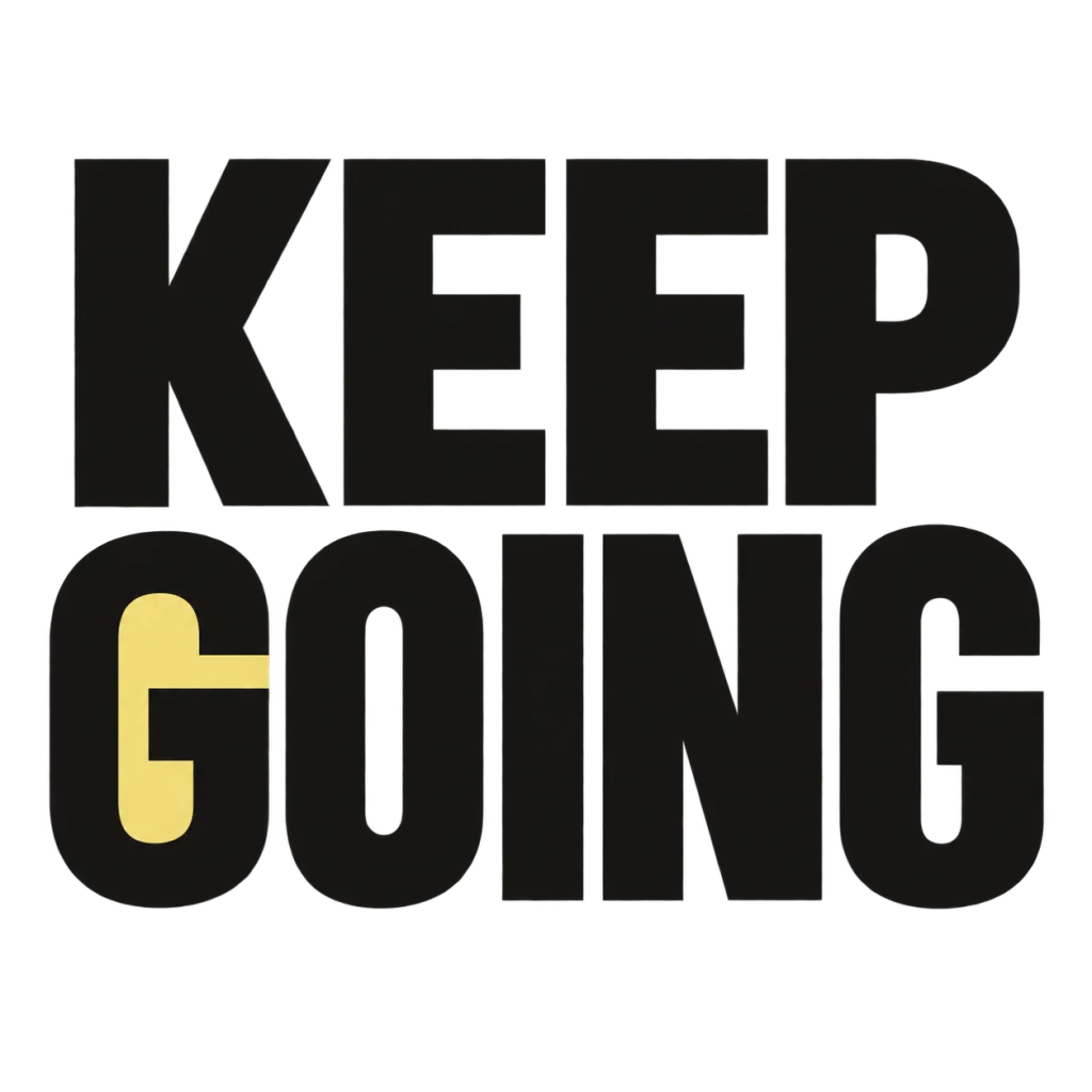
A small nudge for the work that matters.
Use this directionFrom your text to a considered image.
- 01
Enter the short title
Preserve the complete word, spaces, punctuation and Unicode you intend viewers to read.
- 02
Choose one title direction
Start with bold complete letters and an uncomplicated field. Change one visual decision at a time.
- 03
Compose and inspect
Use your own video snapshot in a layout editor. Check the complete preview at small and full sizes before publishing.
Before you create.
Does this make a complete YouTube thumbnail?
It explores a square AI title-image concept. Compose the final thumbnail, any snapshot and supporting text separately in a layout editor.
Can it guarantee more views or a higher CTR?
No. Legibility is a design check; performance requires your own published video and audience data.
Can I edit the lettering as a font?
The artwork is a PNG image, not an installable font or an editable type layer. Keep changeable details as text in your editor.
What about a long title or Chinese text?
Use the exact intended Unicode and inspect every character. Explore a concise phrase if the complete title cannot remain readable; keep the actual video title separate and accurate.
Is the PNG ready to upload as a thumbnail?
Check the completed layout and the current platform specifications first. This starter does not promise a final wide canvas, file-limit compliance, transparency or high-resolution upscaling.
Why is SIDE NOTES shown?
It is an owned September 20 podcast-title concept reused to illustrate two complete reading lines. It is not a new video commission or a finished thumbnail.